Complete Ecommerce Conversion Optimization Checklist: 75 Proven Tactics for 2026 (Excel download)
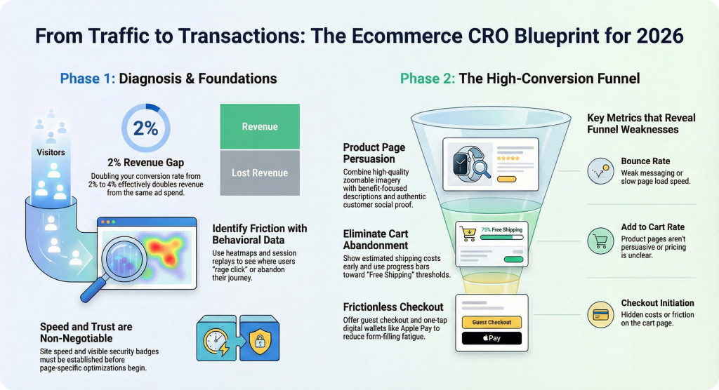
Most ecommerce stores convert between 2-3% of visitors, which means over 97% of your traffic leaves without buying. The difference between a 2% and a 4% conversion rate doubles your revenue from the same ad spend.
This checklist covers 75 specific tactics across your homepage, product pages, cart, checkout, and mobile experience—plus how to diagnose which fixes will actually move the needle for your store.
>> Download Ecommerce CRO Checklist in Excel/Google Sheet
What is an ecommerce conversion rate optimization checklist
An ecommerce conversion rate optimization (CRO) checklist is a structured list of tactics covering every stage of the buyer journey, from landing page to post-purchase. The goal is to increase the percentage of visitors who complete a purchase. Most ecommerce stores convert between 2-3% of visitors, which means the vast majority leave without buying.
Picture a shopper who lands on your product page, scrolls past your add-to-cart button without noticing it, and leaves. That’s a conversion problem hiding in plain sight. A checklist gives you a framework to catch issues like this systematically rather than guessing what to fix.
Most CRO checklists cover four core areas:
- Landing pages: First impressions and messaging alignment with ads
- Product pages: Information and trust elements that drive add-to-cart
- Cart and checkout: Reducing friction before purchase
- Site-wide elements: Navigation, speed, and trust signals
Key ecommerce conversion metrics to track
Before optimizing, you’ll want to know which metrics reveal where visitors drop off. Each one tells you something different about your funnel.
Bounce rate and exit rate
Bounce rate measures visitors who leave after viewing only one page. Exit rate measures the percentage leaving from a specific page. A high exit rate on your checkout page signals different problems than a high exit rate on your homepage. The first suggests checkout friction, while the second might indicate weak messaging.
Product page view rate
This metric tracks the percentage of visitors who reach a product detail page. Low rates often point to navigation issues, poor search functionality, or collection pages that don’t entice clicks.
Add to cart rate
Add to cart rate measures visitors who add at least one item to their cart. When this number is low, your product pages likely aren’t persuasive enough, whether that’s unclear pricing, missing trust signals, or weak product imagery.
Checkout initiation rate
This tracks cart visitors who begin checkout. A gap between add-to-cart and checkout initiation often points to cart page friction, unexpected costs appearing, or shoppers using carts as wishlists.
Purchase conversion rate
The ultimate measure: visitors who complete a purchase. However, this number alone doesn’t tell you where problems live. You’ll want funnel context to diagnose issues.
Average order value
AOV equals total revenue divided by number of orders. Optimizing AOV alongside conversion rate compounds your revenue gains, since you’re getting more value from each converting visitor.
Revenue per session
Total revenue divided by total sessions. This metric combines conversion rate and AOV into a single performance indicator, making it useful for tracking overall funnel efficiency.
How to find where your store loses conversions
A conversion checklist only works if you know which items to prioritize. Behavioral analytics tools help you diagnose specific friction points rather than guessing.
Use funnel analytics to spot drop-off points
Funnel visualization shows the percentage of visitors moving between stages: product view → cart → checkout → purchase. Identifying your biggest drop-off tells you where to focus first.
If 60% of visitors abandon between cart and checkout initiation, that’s where your attention belongs.
Watch session replays to see real friction
Session replay refers to recordings of actual visitor journeys. Watching shoppers hesitate, rage-click, or abandon reveals problems that metrics alone cannot explain. You might discover that visitors repeatedly click on an image expecting it to zoom, or that they scroll past your shipping information without seeing it.
Tools like MIDA let you filter replays by outcome, such as abandoned cart, completed order, or abandoned checkout, so you can compare successful and unsuccessful journeys side by side.
Analyze heatmaps to find ignored elements
Heatmaps are visual overlays showing where visitors click, move, and scroll. Click heatmaps reveal whether your CTAs get attention. Scroll heatmaps show if important content sits below where most visitors stop scrolling.
If your free shipping threshold message lives below the average fold, many shoppers will never see it.
Collect survey feedback to understand why visitors leave
On-site surveys capture qualitative reasons behind abandonment. Targeting surveys to specific moments, like exit intent on checkout, gathers actionable feedback. When survey responses link to session replays, you see exactly what the visitor experienced alongside what they said.
Ecommerce CRO checklist foundation tactics
Foundation elements affect your entire store and deserve attention before page-specific optimizations.
1. Match your ad messaging to your landing page
Message match means ensuring the headline, offer, and imagery on your landing page align with the ad that brought the visitor. When a shopper clicks an ad for “50% off summer dresses” and lands on your generic homepage, they feel misled and leave.
2. Clarify your value proposition above the fold
Above the fold refers to the visible area before scrolling. Visitors arriving on any page benefit from immediately understanding what you sell, why it matters, and what to do next. Vague slogans waste this prime real estate.
3. Strengthen your core offer
No amount of CRO tactics can compensate for weak product-market fit or uncompetitive pricing. Before optimizing tactics, evaluate whether your offer genuinely solves a problem better than alternatives.
4. Improve page load speed
Slow pages increase bounce rates and reduce conversions at every funnel stage. Compressing images, reducing third-party scripts, and using fast hosting all contribute to faster load times.
5. Build trust signals across the site
Trust signals are elements that reduce perceived risk, such as security badges, customer reviews, and money-back guarantees. Trust gets established before visitors will share payment information with an unfamiliar store.
Homepage and hero section conversion checklist
Your homepage sets expectations and directs traffic to relevant products. The hero section carries the most visual weight and communicates value instantly, or fails to.
6. Make your hero section action-oriented
Use a clear headline, supporting subhead, and prominent CTA. “Shop Our Best-Selling Skincare” outperforms “Welcome to Our Store” because it tells visitors exactly what to do.
7. Display clear navigation categories
Visitors expect to find their desired product category within seconds. Use familiar category names and logical groupings rather than clever but confusing labels.
8. Feature best sellers or new arrivals
Surfacing popular or fresh products reduces decision paralysis. Undecided visitors get guidance toward high-converting items rather than facing an overwhelming catalog.
9. Add social proof to the homepage
Display customer counts, review snippets, press logos, or trust badges to establish credibility before visitors explore further.
10. Include a visible search bar
Visitors with high purchase intent often search directly. Place search prominently and ensure it returns relevant results. A search that yields “no results found” is a conversion killer.
Collection and category page CRO checklist
Collection pages bridge discovery and product selection. Poor experiences here cause visitors to leave before ever seeing product details.
11. Use descriptive collection page headers
Generic headers like “Products” waste an opportunity to reinforce relevance and include keywords. “Women’s Running Shoes” tells visitors they’re in the right place.
12. Add filtering and sorting options
Visitors browsing large catalogs want to narrow by size, color, price, or other attributes. Missing filters cause frustration and abandonment.
13. Display quick-view or add to cart buttons
Reducing clicks to add a product speeds the path to purchase for confident buyers who don’t want to visit every product page.
14. Show product ratings in grid view
Displaying star ratings helps visitors quickly identify well-reviewed products without clicking into each one.
15. Include collection-level social proof
Category-specific testimonials or “most popular in this category” labels reinforce buyer confidence at the browsing stage.
Product page conversion rate optimization checklist
Product pages are where purchase decisions happen. Each element answers objections and builds enough confidence to add to cart.
16. Use high-quality product images with zoom
Visitors cannot touch products online, so images carry the burden of showing detail, scale, and context. Enable zoom on desktop and pinch-to-zoom on mobile.
17. Add product videos or GIFs
Motion shows the product in use, demonstrates size, and answers questions static images cannot. A 15-second video of a bag being opened reveals more than five static photos.
18. Write benefit-focused product descriptions
Shift from feature lists to explaining how the product improves the customer’s life. “Waterproof membrane keeps feet dry on rainy commutes” beats “Features waterproof membrane.”
19. Display pricing and discounts clearly
Show the current price prominently, with strike-through original prices when discounted. Hidden fees that surprise visitors later cause checkout abandonment.
20. Show stock availability and urgency cues
Low-stock indicators or limited-time offers create urgency, but only when truthful. Fake urgency erodes trust quickly.
21. Add customer reviews and ratings
Reviews provide social proof and answer questions your copy might miss. Displaying both positive and constructively critical reviews builds authenticity.
22. Include user-generated photos
Customer photos show the product in real-world contexts, building trust beyond polished brand imagery.
23. Optimize the buy box layout
The buy box, the section containing price, variants, and add-to-cart button, carries the most conversion weight on the page. This area benefits from being visually distinct and easy to use on all devices.
24. Add size guides or product specifications
Missing sizing or dimension information causes hesitation and increases returns. Visual guides work better than text-only specifications.
25. Display shipping and return information
Unclear shipping costs or policies cause checkout abandonment. Show estimated delivery and return terms on the product page, not just at checkout.
26. Use product recommendations below the fold
“You may also like” or “Frequently bought together” sections increase AOV and help visitors find alternatives if the current product isn’t right.
27. Add a sticky add to cart button on mobile
Mobile visitors scroll extensively. A sticky button keeps the CTA accessible without scrolling back up.
Cart page conversion checklist
The cart page is where visitors confirm their selections before committing to checkout. Friction here causes abandonment even after strong product page performance.
28. Display a clear cart summary
Show each item with name, variant, quantity, and price. Avoid clutter that distracts from proceeding to checkout.
29. Show product thumbnails and editable quantities
Visual confirmation reduces anxiety. Easy editing prevents visitors from leaving to make changes elsewhere.
30. Display estimated shipping costs early
Surprise shipping costs at checkout are a leading cause of abandonment. Show estimates on the cart page or earlier.
31. Add cross-sell or upsell recommendations
Suggesting complementary products or upgrades increases AOV. Keep recommendations relevant and non-intrusive.
32. Include trust badges and payment icons
Displaying accepted payment methods and security badges reassures visitors their transaction will be safe.
33. Show a progress indicator toward free shipping
A “You’re $15 away from free shipping” bar motivates additional purchases and reduces perceived shipping friction.
34. Make the checkout button prominent
Use contrasting color and sufficient size so the primary CTA stands out from secondary actions like “Continue Shopping.”
35. Add a save for later option
Some visitors aren’t ready to buy but want to return. Wishlist or save-for-later features prevent permanent abandonment.
Checkout page CRO checklist
Checkout is where final conversion happens or fails. Even small friction points cause visitors to abandon after demonstrating strong purchase intent.
36. Offer guest checkout
Forcing account creation adds friction at exactly the wrong moment. Allow guest checkout with optional account creation after purchase.
37. Reduce form fields to essentials
Every additional field increases cognitive load and abandonment risk. Remove optional fields and combine where possible.
38. Use autofill and address validation
Browser autofill and real-time address suggestions reduce typing and errors, especially on mobile where typing is tedious.
39. Display all costs before the final step
Show taxes, shipping, and any fees in a clear summary before asking for payment. Last-second surprises destroy trust.
40. Offer multiple payment options
Different customers prefer different methods, including credit card, PayPal, Shop Pay, and Apple Pay. Missing preferred options causes abandonment.
41. Show security badges and SSL indicators
Visible security symbols reduce anxiety about entering payment information.
42. Add a clear return policy summary
A brief, reassuring return policy statement at checkout reduces perceived purchase risk.
43. Send abandoned checkout recovery emails
Timely, personalized emails can recover a portion of abandoned checkouts. Include the cart contents and a direct link back.
44. Optimize the mobile checkout experience
Mobile shoppers face smaller screens and touch input challenges. Test checkout on multiple devices to identify friction. Session replay tools can show exactly where mobile users struggle during checkout.
45. Use express checkout options
One-click options like Shop Pay or Apple Pay dramatically reduce checkout friction for returning customers.
Site-wide conversion rate optimization tactics
Site-wide elements affect the entire shopping experience regardless of which page a visitor is on.
46. Implement intuitive navigation menus
Use clear labels, logical hierarchy, and mega menus for large catalogs. Test navigation with real users to catch confusing structures.
47. Add predictive site search
Autocomplete suggestions and typo tolerance help visitors find products faster.
48. Display live chat or contact options
Accessible support resolves objections in real time. Place chat widgets where hesitation is likely, such as product pages and checkout.
49. Create an FAQ page for common objections
Proactively answering shipping, return, sizing, and product questions reduces support burden and purchase hesitation.
50. Use exit-intent popups strategically
Exit-intent popups are overlays triggered when a visitor moves to leave. Offer a discount or email capture without being intrusive.
51. Add sticky promotional bars
Announcement bars highlighting free shipping thresholds or sales keep offers visible without interrupting browsing.
52. Implement personalized product recommendations
Using browsing history or purchase data to surface relevant products increases relevance and conversion.
53. Use urgency and scarcity tactfully
Countdown timers and low-stock alerts work only when genuine. Fake urgency erodes trust.
54. Optimize for Core Web Vitals
Core Web Vitals are Google’s metrics for page experience, covering loading, interactivity, and visual stability. Poor scores hurt both conversions and search rankings.
55. Add breadcrumb navigation
Breadcrumbs help visitors understand their location and navigate back to categories without using the back button.
56. Use clear and consistent CTAs
Maintain consistent button styling, language, and placement so visitors always know what action to take.
57. Display trust badges in the footer
Security certifications, payment icons, and guarantee statements in the footer serve as a final reassurance layer.
58. Offer a loyalty or rewards program
Points or perks for purchases encourage repeat buying and increase customer lifetime value.
Mobile ecommerce conversion checklist
Mobile visitors often have different behaviors and constraints than desktop users. Mobile-specific optimizations address these differences.
59. Design touch-friendly buttons and tap targets
Small buttons cause mis-taps and frustration. Ensure adequate spacing and size for finger input.
60. Simplify mobile navigation
Use hamburger menus, collapsible categories, and prominent search to accommodate small screens.
61. Use thumb-friendly add to cart placement
Position key CTAs where thumbs naturally rest to reduce reach and effort.
62. Optimize mobile image loading
Serve appropriately sized images for mobile screens to improve speed without sacrificing quality.
63. Enable mobile autofill and digital wallets
Mobile typing is tedious. Autofill and one-tap payment options significantly reduce friction.
64. Test across multiple devices and screen sizes
Layout issues often appear on specific devices. Cross-device testing catches problems. Heatmap tools with device filtering let you compare behavior across desktop, tablet, and mobile.
Common ecommerce conversion mistakes to avoid
Even well-intentioned optimizations can backfire. Avoiding frequent mistakes saves time and prevents lost revenue.
65. Hiding shipping costs until checkout
Unexpected costs are the top reason for checkout abandonment. Show shipping estimates as early as possible.
66. Using slow-loading images or scripts
Heavy files delay page rendering and frustrate visitors. Compress images and audit third-party scripts regularly.
67. Forcing account creation before purchase
Mandatory registration creates unnecessary barriers. Offer guest checkout and post-purchase account creation.
68. Cluttering pages with too many CTAs
Competing calls-to-action confuse visitors about what to do next. Use a clear visual hierarchy with one primary CTA per view.
69. Ignoring mobile user experience
Mobile often accounts for most traffic but receives less optimization attention. Prioritize mobile testing and design.
70. Neglecting product page trust signals
Missing reviews, security badges, or policy information leaves objections unanswered.
71. Making the returns policy hard to find
Buried return information increases purchase hesitation. Link to your policy from product and checkout pages.
72. Overusing popups that block content
Aggressive popups frustrate visitors and can hurt mobile rankings. Use timed or exit-intent triggers sparingly.
How to prioritize your CRO checklist
You cannot implement every tactic at once. Sequencing optimizations for maximum impact matters.
73. Start with high-traffic pages
Improvements on high-traffic pages affect more visitors. Use analytics to identify your most-visited pages and prioritize those.
74. Fix checkout and cart issues first
Visitors who reach cart and checkout have demonstrated strong intent. Friction here has the highest cost per lost visitor.
75. Validate changes with behavioral data
Assumptions about what works can be wrong. Use session replays, heatmaps, and funnel analytics to measure the impact of changes before and after. MIDA provides these tools in a single Shopify-native platform so you can watch the exact sessions behind every conversion or abandonment.
Stop guessing and start optimizing
An ecommerce conversion checklist provides structure, but real optimization requires seeing what your visitors actually do. Combining this checklist with behavioral analytics lets you prioritize fixes based on evidence rather than guesswork.
Try MIDA free to start watching real shopper journeys and turning friction into revenue.
FAQs about ecommerce conversion checklists
How often should I audit my store using an ecommerce CRO checklist?
Review your checklist quarterly or whenever you make significant changes to your site, product catalog, or marketing campaigns. This cadence catches new friction points early without creating unnecessary busywork.
What is a good ecommerce conversion rate to aim for?
Conversion rate benchmarks vary by industry, traffic source, and product type. A 3% rate might be excellent for high-ticket electronics but below average for consumable products. Focus on improving your own baseline rather than chasing a universal number.
Should I implement all checklist items at once or test incrementally?
Implement changes incrementally and validate each one with behavioral data. This approach lets you isolate what works and avoid compounding unintended effects from multiple simultaneous changes.
How do I know which checklist items to prioritize first?
Prioritize items affecting your highest-traffic pages and your biggest funnel drop-off points. Optimizations in those areas will impact the most visitors and address the most significant revenue leaks.
Can I use this conversion rate optimization checklist for platforms other than Shopify?
Most tactics apply to any ecommerce platform. Specific implementation steps may differ based on your platform’s features and limitations, but the underlying principles remain consistent.

Hien Tran
I’m Hien Tran, a Product Marketing Executive at MIDA, specializing in eCommerce growth and conversion optimization. I focus on bridging product capabilities with real merchant needs—turning insights from heatmaps, session replays, and funnel analytics into actionable strategies that drive measurable results.


