What Is a Heatmap? Definition, Types, and Use Cases
A heatmap is a data visualization technique that uses color to represent values—warm colors like red and orange show high activity or magnitude, while cool colors like blue and green indicate low values. Originally borrowed from thermal imaging, heatmaps now appear everywhere from website analytics to gene expression research to geographic mapping.
This guide covers how heatmaps work, the different types you’ll encounter, and practical use cases across industries—with particular focus on how ecommerce teams use them to see exactly where visitors click, scroll, and get stuck.
>> You may also like:
What Is a Heatmap
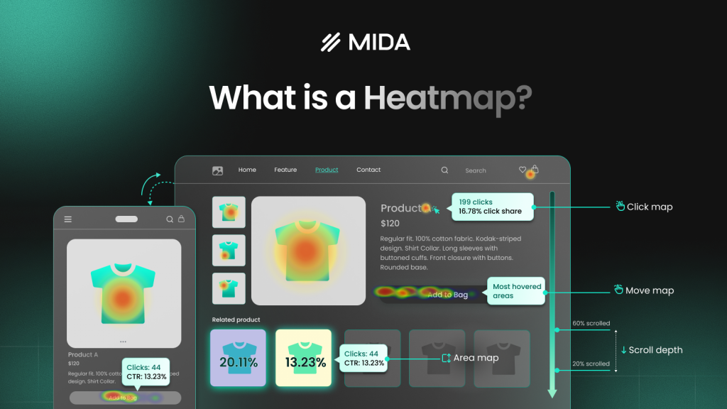
A heatmap is a data visualization technique that uses color to represent the magnitude of values in a dataset. Warm colors like red and orange indicate high values or activity, while cool colors like blue and green show low values. The term originally came from thermal imaging, but heatmaps now visualize everything from website user behavior to gene expression data to geographic rainfall patterns.
Think of a website heatmap like a thermal camera for your store. Instead of measuring temperature, it measures where visitors click, how far they scroll, and which elements capture attention. The result is an instant visual summary that reveals patterns you’d never spot in a spreadsheet or standard analytics dashboard.
- Hot spots: Areas where visitors concentrate clicks, attention, or time appear in warm reds and oranges
- Cold spots: Sections visitors skip or ignore show up in cool blues and greens
- Color gradient: The spectrum between hot and cold reveals the full range of engagement levels across your page
How Heatmaps Work
The mechanics behind a heatmap are straightforward. First, a tracking system collects data—whether that’s clicks on a webpage, values in a database, or measurements across a geographic region. Then, that data gets mapped onto a visual grid where color intensity corresponds to frequency or magnitude.
For website heatmaps specifically, a small tracking code captures visitor interactions like clicks, cursor movement, and scroll depth. Individual actions get aggregated across all visitors to reveal patterns. Finally, the aggregated values translate into a color spectrum, typically ranging from blue (low activity) through green and yellow to red and orange (high activity).
The power of this approach lies in pattern recognition. Google Analytics might tell you that 2,000 people visited your product page yesterday. A heatmap shows you that 1,800 of them never scrolled past the first image—and that 400 clicked on a decorative element thinking it was a button.
Benefits of Using Heatmaps
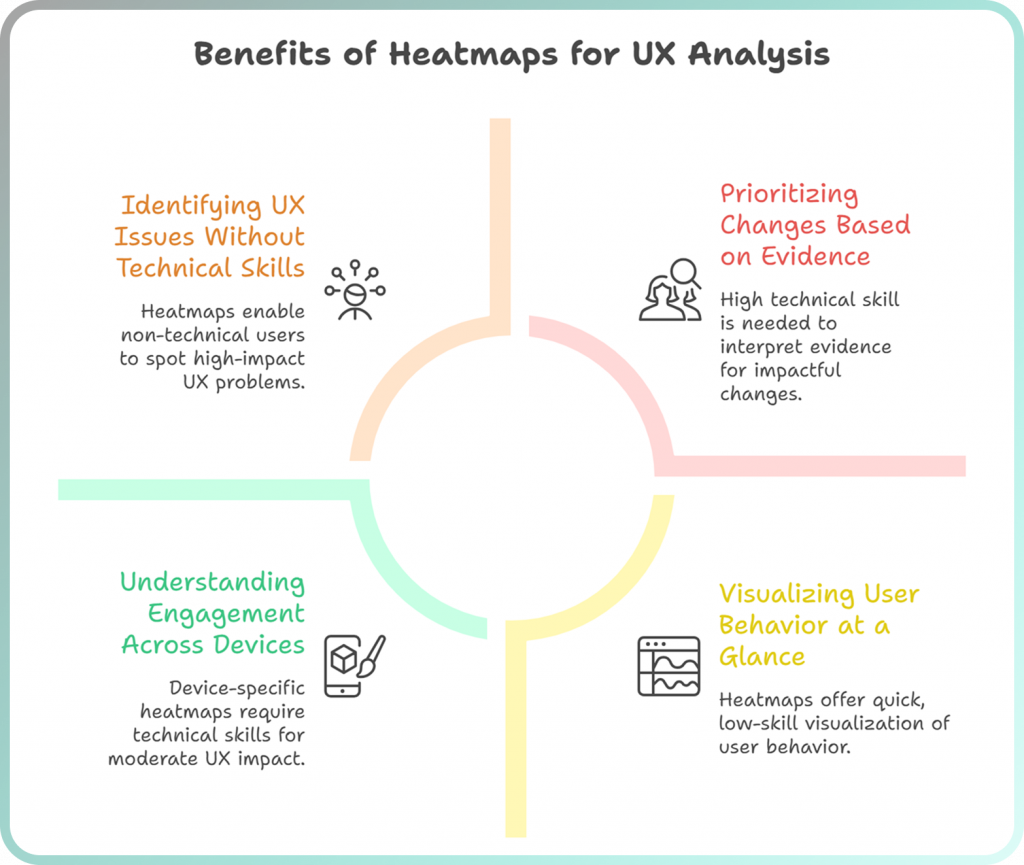
Visualize User Behavior at a Glance
Heatmaps compress complex behavioral data into something you can understand in seconds. You don’t parse through rows of numbers or build custom reports—the colors tell the story immediately.
Consider the difference: Google Analytics might show you a 65% bounce rate on your homepage. A heatmap reveals that visitors are clicking furiously on an image that isn’t actually linked to anything. One tells you there’s a problem; the other shows you exactly what the problem is.
Identify UX Issues Without Technical Skills
Anyone on your team can spot problems in a heatmap. You don’t need a data analyst to interpret what it means when there’s a bright red cluster of clicks on a non-clickable element, or when the scroll map fades to blue before visitors reach your call-to-action.
Heatmaps also surface specific friction signals that traditional analytics miss entirely:
- Rage clicks: Rapid, repeated clicks that signal frustration when something isn’t responding as expected
- Dead clicks: Clicks on elements that aren’t interactive, revealing where visitors expect functionality that doesn’t exist
- Error clicks: Clicks that trigger JavaScript errors, often invisible to the visitor but blocking their intended action
Prioritize Changes Based on Evidence
When you can see exactly where visitors struggle, you stop debating opinions and start fixing real problems. Heatmaps reveal what to address first by showing the magnitude of each issue—a button that 500 people tried to click but couldn’t takes priority over a minor layout preference.
Understand Engagement Across Devices
Mobile and desktop visitors behave differently, and heatmaps make these differences visible. Mobile users typically scroll less, tap more impulsively, and struggle with elements that work fine on larger screens. Segmented heatmaps let you see each device type separately, so you can optimize layouts for how people actually use them.
Types of Heatmaps
Different heatmap types answer different questions. Most stores benefit from tracking multiple types simultaneously because each reveals distinct patterns in how visitors interact with your pages.
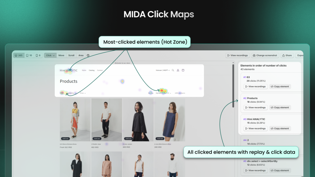
Click Heatmaps
Click heatmaps visualize every tap and click on your page, with warmer colors marking high-activity zones. They’re particularly useful for testing button placement, identifying broken links that visitors try to click, and discovering distracting elements that steal attention from conversion-critical areas.
On mobile devices, click heatmaps reveal whether tap targets are large enough or if visitors accidentally hit adjacent elements. They also expose rage clicks—those rapid, frustrated taps on elements that don’t respond—which signal major UX problems that traditional analytics completely miss.
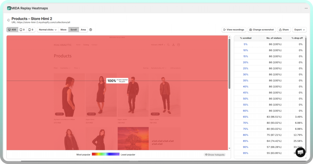
Scroll Heatmaps
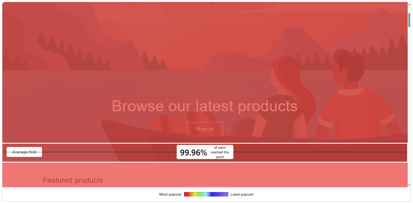
Scroll heatmaps display how far down each page visitors scroll before leaving, typically shown as percentage bands or color gradients that fade from red at the top to blue at the bottom. The data answers critical questions about content length and placement.
You might discover that 90% of visitors see your hero image but only 35% make it to your product reviews. If your most compelling content sits below where most visitors stop scrolling, you’re effectively hiding it from the majority of your audience.
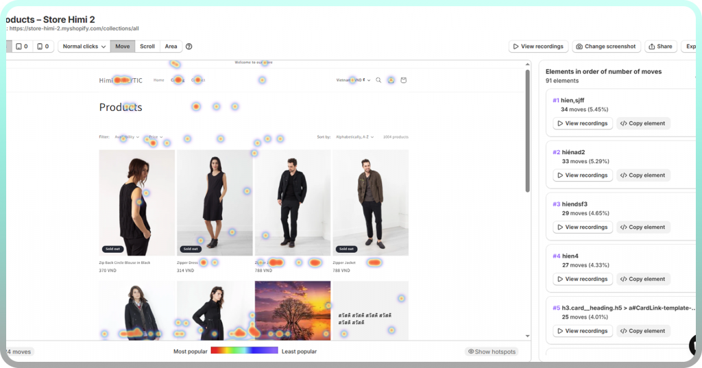
Movement Heatmaps
Movement heatmaps track cursor position as a proxy for visual attention. Eye-tracking research shows that people tend to look where they move their mouse, so movement maps reveal which sections draw natural attention versus which get skipped.
However, movement data is less reliable than click or scroll data since some visitors move their cursor randomly while reading. Look for patterns across many sessions rather than drawing conclusions from individual recordings.
Attention Heatmaps
Attention heatmaps estimate where visitors focus by combining multiple signals—time spent, movement patterns, and click activity. They’re useful for understanding what draws the eye and holds interest, particularly on content-heavy pages.
Data Visualization Heatmaps
Beyond websites, heatmap charts appear throughout business analytics, science, and geography. Sales teams use them to visualize performance across regions or time periods. Biologists map gene expression levels. Meteorologists display temperature and rainfall patterns. The underlying principle remains the same: color-coding values makes patterns instantly visible in ways that tables of numbers cannot.
Common Heatmap Use Cases
Ecommerce and Product Page Optimization
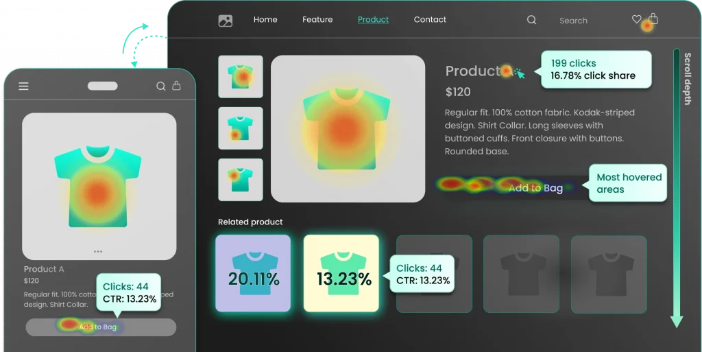
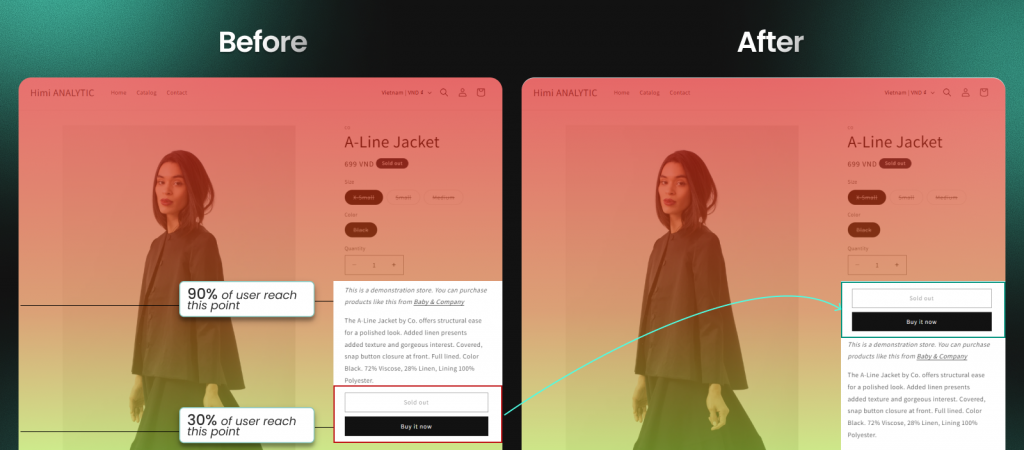
Store owners use heatmaps to see which product images, descriptions, and CTAs shoppers engage with—and where they hesitate before adding items to their cart. You might discover that visitors click on size charts expecting more detail, or that they ignore your “Add to Cart” button because a nearby badge draws more attention.
>> Don’t skip: Turn Heatmaps into Product Page Wins with MIDA
Website and Landing Page Analysis
Marketers use heatmaps to understand how visitors interact with landing pages after clicking an ad. The data reveals whether key messages and CTAs actually get seen, or whether visitors bounce before reaching the content that would convince them to convert.
Form and Checkout Optimization
Heatmaps reveal where visitors abandon forms or checkout flows. You might find that people repeatedly click between your cart and product pages because shipping costs aren’t displayed early enough, or that they hover over a form field for 20 seconds trying to understand what information you’re requesting.
A/B Test Validation
Heatmaps add context to A/B test results by showing not just which version won, but why visitors behaved differently on each version. Quantitative data tells you Version B converted 15% better; heatmap data shows you that visitors on Version B actually scrolled to see the testimonials while Version A visitors stopped scrolling before reaching them.
Content and Marketing Performance
Content teams use scroll and click heatmaps to understand which articles hold attention and which CTAs convert readers. If your scroll map shows visitors dropping off at the same point across multiple articles, you’ve found a content structure problem worth fixing.
How to Interpret a Heatmap
Reading a heatmap correctly requires understanding what the colors and patterns actually mean—and what they don’t.
Understanding Heatmap Color Scales
Color gradients typically show red and orange for high activity and blue and green for low activity, though some tools use different palettes. Always check the legend to understand what the colors represent, since “high” might mean 500 clicks on one page and 50 on another.

Reading Click Patterns
Concentrated clicks indicate clear interest, while scattered clicks can signal confusion. Pay particular attention to clicks on elements that aren’t clickable—these reveal where visitors expect functionality that doesn’t exist.
A cluster of clicks on a product image might mean visitors want to zoom in. Clicks on a heading might mean they expect it to expand or link somewhere. These patterns point directly to UX improvements.
Analyzing Scroll Depth
The gradient on a scroll map shows where visitors stop scrolling. Most tools display an “average fold” line indicating what’s visible without scrolling on typical screens. Content below high drop-off zones reaches fewer visitors, so placement decisions matter.
Spotting Rage Clicks and Dead Clicks
Rage clicks appear as intense clusters of rapid, repeated clicks—the visual signature of frustration. Dead clicks show up as activity on non-interactive elements. Both signal UX problems that deserve immediate attention, and both are invisible in traditional analytics.
Best Practices for Heatmap Analysis
Collect Enough Data Before Drawing Conclusions
Heatmaps require sufficient visitor volume to show reliable patterns. A pattern that appears in 50 sessions might be noise; the same pattern in 500 sessions is a signal worth acting on.
Segment by Device and Traffic Source
Mobile and desktop visitors behave differently, as do visitors from different channels. A heatmap combining all traffic might mask critical differences—your mobile checkout could be broken while your desktop checkout works fine, and combined data would hide the problem.
Combine Heatmaps With Session Replay
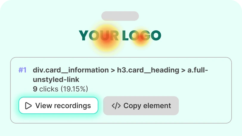
Heatmaps show aggregate patterns, but session recordings let you watch individual visitor journeys for deeper context. When you spot an unusual click cluster in a heatmap, you can jump directly into recordings of sessions where those clicks occurred to understand what visitors were trying to accomplish.
Try Mida free to combine heatmaps with session recordings in one Shopify-native platform.
Focus on High-Impact Pages First
Start your analysis with pages that directly drive revenue or conversions—product pages, checkout flows, and key landing pages. Optimizing a page that receives 10,000 monthly visitors delivers more impact than perfecting a page that receives 100.
Avoid Common Heatmap Interpretation Mistakes
- Assuming red always means success: High clicks on a broken element indicate frustration, not engagement
- Ignoring mobile data: Desktop heatmaps don’t represent mobile user behavior
- Over-relying on movement maps: Cursor movement doesn’t always equal eye movement, especially on mobile where there’s no cursor
How to Create a Heatmap
Setting up website heatmaps is straightforward with the right tool. Most Shopify heatmap apps install in under five minutes without requiring any coding knowledge.
1. Choose a Heatmap Tool for Your Platform
Platform-native tools often integrate more deeply with your store data. Shopify-specific apps automatically capture checkout events, cart interactions, and revenue data without custom implementation. Consider what types of heatmaps you need and whether you want connected features like session replay and on-site surveys.
2. Install Tracking on Your Website
Most tools require adding a tracking snippet or installing an app. Shopify merchants can typically install directly from the app store—click “Install app” and tracking begins automatically. Check your app’s settings to configure data retention, enable cookie consent if needed, and exclude sensitive pages from recording.
3. Select Pages to Analyze
Prioritize high-traffic and high-value pages first. You can generate heatmaps for any page once tracking is active, but focusing on pages that impact revenue delivers the fastest return on your analysis time.
Write down specific questions you want answered before diving into the data: Why do visitors abandon at checkout? Which product page elements drive engagement? Do visitors see your shipping information before deciding to buy?
Turn Heatmap Insights Into Higher Conversions
Heatmaps are only valuable when you act on what they reveal. The color-coded patterns show you where visitors click, scroll, and hesitate—but the real work begins when you translate those patterns into specific changes.
Start with the most obvious friction signals: rage clicks on broken elements, dead clicks on non-interactive images, scroll drop-offs before critical content. Then layer in session recordings to understand context. When you see an unusual pattern in your heatmap, watch the actual sessions where that behavior occurred.
Tools like Mida combine heatmaps with session replay and commerce analytics so you can move from insight to action in one platform—seeing exactly where Shopify shoppers get stuck and connecting that behavior to revenue outcomes.
FAQs About Heatmaps
How do I create a heatmap in Excel?
You can create a basic heatmap in Excel using conditional formatting. Select your data range, go to Home > Conditional Formatting > Color Scales, and Excel will shade cells based on their values. This works well for data matrices like sales by region and month, though it won’t help with website behavior analysis.
How do I create a heatmap in Python?
Python libraries like Seaborn and Matplotlib generate heatmaps from data arrays. The function seaborn.heatmap() accepts a data matrix and produces a color-coded visualization with customizable palettes and annotations. This approach is common in data science for visualizing correlation matrices and other tabular data.
How many visitors do I need for an accurate website heatmap?
The key is consistency—a pattern that appears across multiple days and visitor segments is more reliable than one that shows up in a single day’s data. Higher-traffic pages reach useful thresholds quickly; lower-traffic pages may require patience.
What is the difference between a heatmap and a session recording?
A heatmap shows aggregated behavior patterns across all visitors—the combined clicks, scrolls, and movements of everyone who visited a page. A session recording plays back an individual visitor’s journey, showing exactly what happened during their specific session. Heatmaps reveal patterns; recordings explain context.
Are website heatmaps GDPR compliant?
Most heatmap tools anonymize visitor data and exclude personal information by default. However, you’re responsible for disclosing tracking in your privacy policy and implementing cookie consent where required. Verify your tool’s privacy settings and data processing agreements before deploying on stores that serve EU visitors.
Do heatmap tools slow down website performance?
Reputable heatmap tools load asynchronously, meaning their tracking scripts load after your page content renders. You can verify performance impact by running Google PageSpeed Insights before and after installation to measure any changes to Core Web Vitals scores.


