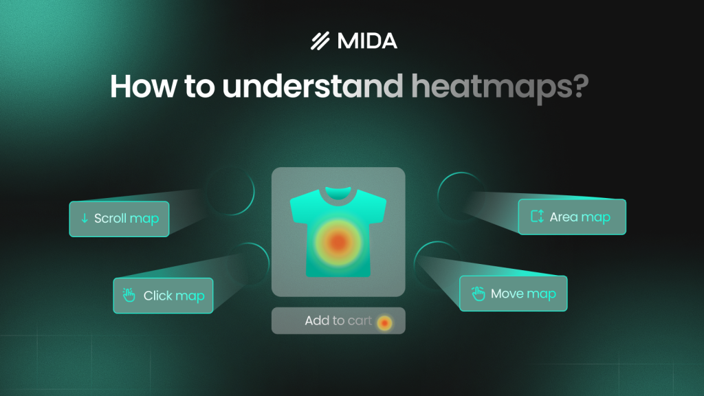
How to Understand Heatmaps: A Complete Guide
Your analytics dashboard shows 500 visitors landed on your product page yesterday, but it can’t tell you that 400 of them never scrolled past the hero image—or that dozens clicked on a product photo expecting it to zoom. Heatmaps translate raw visitor behavior into color-coded visuals that reveal exactly where people look, click, and lose interest.
This guide covers how heatmap colors work, the different types of heatmaps available, and a step-by-step process for reading and interpreting the data to improve your store’s conversion performance.
What Is a Heatmap
A heatmap is a visual representation that uses color to show where activity happens on a page. Warm colors like red and orange mark high activity—areas where visitors click, scroll, or focus their attention. Cool colors like blue and purple indicate low activity—sections that get ignored or overlooked.
Think of it like a thermal camera for your website. Instead of guessing which elements attract attention, you see exactly where visitors focus their eyes and fingers. Google Analytics tells you 200 people visited your product page; a heatmap reveals that 180 of them never scrolled past the first image.
How Heatmap Colors Work
Every heatmap translates raw data into a color gradient you can interpret at a glance. The color scale works the same way across most tools, though the specific shades vary.
Here’s how to read the colors:
- Warm colors (red, orange, yellow): High values—most clicks, longest attention, highest engagement
- Cool colors (blue, green, purple): Low values—few clicks, ignored areas, minimal engagement
- Color intensity: Darker shades mean higher magnitude within that color range; lighter shades mean lower
Before drawing any conclusions, locate the legend or color key. The legend tells you what each shade represents—click count, percentage of users, or time spent in an area. Different tools use different scales, so what looks “hot” in one heatmap might represent a different threshold in another.
On a product page, you might see red clustered around the main product image and “Add to Cart” button, while the footer sits in deep blue. That pattern tells you visitors focus on the top of the page and rarely scroll to the bottom.
Why Use Heatmaps on Your Website
Traditional analytics platforms show outcomes like bounce rates and conversion percentages, but they don’t explain the reasoning behind those numbers. You know 65% of customers abandon at checkout, but you don’t know if they’re confused by a form field, surprised by shipping costs, or clicking a broken element.
Heatmaps bridge that gap by revealing actual visitor behavior.
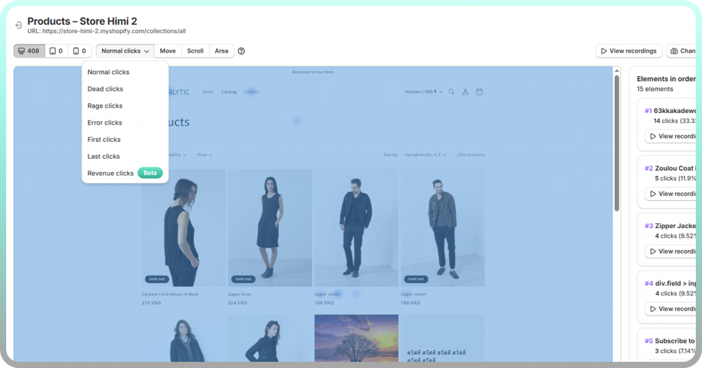
Find Where Visitors Click and Ignore
Click heatmaps expose which elements attract attention versus which get overlooked entirely. You might discover that visitors repeatedly click on product images expecting a zoom function that doesn’t exist. Or that a non-clickable heading draws more attention than your primary call-to-action button.
The data frequently reveals “false bottoms” where visitors assume the page has ended because of poor visual hierarchy.
Discover How Far Users Scroll
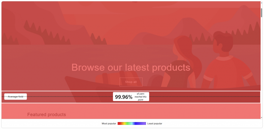
Scroll heatmaps display the percentage of visitors who reach each section of your page. If your most compelling product details sit below the fold where only 30% of visitors scroll, you’re hiding your best content from 70% of potential customers.
The data removes mystery about content placement. You stop guessing where to put trust badges, shipping information, and social proof—and start placing them where visitors actually look.
Identify UX Friction and Frustration
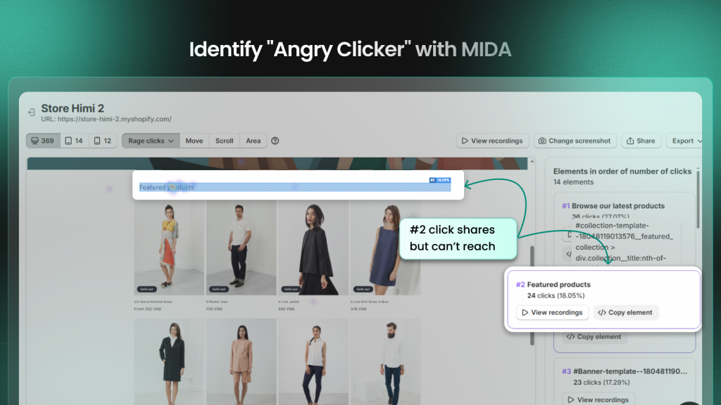
Rage clicks happen when users click repeatedly on the same spot out of frustration—usually because an element looks clickable but doesn’t respond. Dead clicks occur when visitors tap on non-interactive elements expecting something to happen.
Both signals indicate confusion worth investigating. A heatmap showing concentrated rage clicks on a product image might mean visitors expect a zoom function that doesn’t exist.
Validate Design Changes With Evidence
Before-and-after heatmap comparisons show whether a new layout actually improves engagement or just looks better to your team. Instead of debating design preferences, you watch actual visitor behavior and see which placement generates more engagement.
Types of Website Heatmaps
Different heatmap types answer different questions about visitor behavior. Each one reveals a distinct pattern in how people interact with your pages.
Click Heatmaps
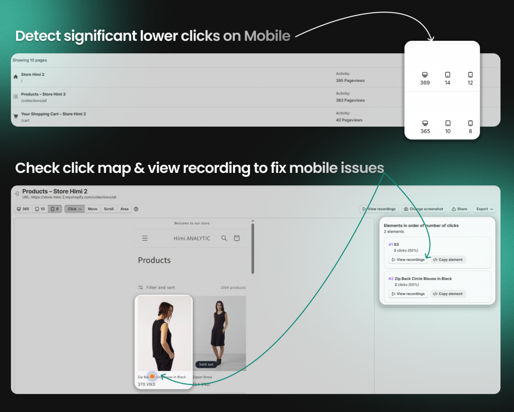
Click heatmaps track where users click or tap. They show which elements get the most interaction and which get ignored. On mobile devices, click heatmaps reveal whether buttons are large enough to tap accurately or if visitors accidentally click adjacent elements.
Scroll Heatmaps
Scroll heatmaps display how far down visitors scroll before leaving. The color gradient typically fades from red at the top to blue at the bottom, with percentage markers showing what portion of visitors reached each depth.
Most stores discover that mobile users scroll less than desktop visitors. Your mobile layout often requires different content prioritization because what works on desktop frequently fails on mobile.
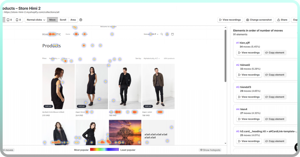
Movement Heatmaps
Movement heatmaps track mouse cursor position, which often correlates with eye movement on desktop. They show areas users hover over or appear to read.
However, mouse movement data is less reliable than click or scroll data since some users move their cursor randomly while reading. Look for patterns across many sessions rather than drawing conclusions from individual recordings.
Rage Click and Error Click Heatmaps
Rage click heatmaps highlight clicks that indicate frustration—repeated rapid clicks on the same spot or clicks on broken elements. They flag UX problems that traditional analytics completely miss.
Device Specific Heatmaps
Behavior differs dramatically between desktop, tablet, and mobile. A button that gets plenty of clicks on desktop might be nearly invisible on mobile. Always segment heatmaps by device type to avoid drawing misleading conclusions from combined data.
How to Read a Heatmap Step by Step
Reading a heatmap effectively follows a repeatable process. Rather than glancing at colors and guessing, work through each step to extract actionable insights.
1. Start With the Color Legend
Locate the legend or color key first. Understand what the color range represents for this specific heatmap—clicks, scroll percentage, engagement time, or something else. Never assume the scale matches what you’ve seen in other tools.
2. Identify High and Low Activity Zones
Look for hot spots (red and orange clusters) and cold spots (blue and purple areas). Hot spots show where attention concentrates. Cold spots reveal ignored or unseen content.
Ask yourself:
- Where are the brightest areas on the page?
- What elements sit in cold zones?
- Does the activity pattern align with your page goals?
3. Look for Unexpected Patterns
Watch for anomalies that reveal problems: clicks on non-clickable images, heavy activity on secondary elements while primary CTAs get ignored, or sudden drop-offs mid-page. These patterns signal optimization opportunities that surface-level analytics would never show.
4. Compare Activity Against Page Goals
The key question: Is the hottest area the action you want users to take? If your “Add to Cart” button sits in a cold zone while a decorative banner attracts all the attention, the page isn’t working as intended.
5. Segment by Device and Visitor Type
Don’t analyze aggregate data alone. Filter by device (mobile vs. desktop) and visitor type (new vs. returning, traffic source). Behavior patterns differ significantly across segments, and combined data can mask critical issues.
How to Interpret Heatmap Data for Online Stores
Ecommerce pages have specific conversion goals, and heatmap interpretation changes when you’re optimizing for revenue rather than general engagement.
Connect Clicks to Add to Cart Behavior
On product pages, check if clicks cluster around the “Add to Cart” button or get scattered across variant selectors, size guides, and images. If shoppers click everything except the buy button, the page layout likely requires attention.
Analyze Scroll Depth on Product Pages
Determine if key information—price, shipping details, reviews—sits above or below where most visitors stop scrolling. If reviews drive conversions but live below the scroll cutoff, moving them up could directly impact sales.
Spot Checkout and Cart Friction Points
Heatmaps on cart and checkout pages reveal where shoppers hesitate. You might see visitors clicking back repeatedly, hovering over shipping costs, or abandoning at specific form fields. These signals pinpoint abandonment causes that conversion rate data alone can’t explain.
Combine Heatmaps With Session Recordings
Heatmaps show “what” happened across all visitors as an aggregate pattern. Session recordings show “why” by playing back individual journeys. When a heatmap reveals unexpected cold spots, watching recordings of those sessions helps you understand the behavior behind the pattern.
Tools like MIDA connect both views, letting you move from aggregate patterns to individual context without switching between disconnected platforms.
Common Heatmap Mistakes to Avoid
Even experienced analysts make interpretation errors that lead to wrong conclusions. Knowing these pitfalls helps you avoid wasted optimization efforts.
Drawing Conclusions From Low Traffic
Heatmaps require sufficient visitor volume to show reliable patterns. A handful of sessions creates random-looking data that shifts with each new visitor. Wait until enough traffic accumulates before making decisions.
Ignoring Mobile and Desktop Differences
Combining all devices into one heatmap obscures critical differences. What works on desktop often fails on mobile, and vice versa. Always analyze device types separately.
Focusing Only on Click Data
Clicks alone don’t tell the full story. Scroll depth, movement patterns, and rage clicks add essential context. Use multiple heatmap types together for a complete picture.
Missing the Context Behind Patterns
A cold zone isn’t automatically bad—it might be intentional whitespace. A hot zone isn’t automatically good—it might represent confused clicking on a broken element. Always interpret patterns with page intent in mind.
How to Create a Heatmap for Your Store
Setting up heatmap tracking on a Shopify store typically takes just a few minutes. Here’s the process:
- Choose a heatmap tool: Select one that integrates with your platform—Shopify-native apps like MIDA avoid manual code installation and automatically track checkout events
- Install tracking: Most tools add their script automatically when you install the app
- Select pages to track: Start with high-impact pages like your homepage, top product pages, cart, and checkout
- Wait for data: Allow enough traffic to accumulate before analyzing
- Generate your first heatmap: Access the dashboard, select a page, and choose your heatmap type
Try MIDA free to see heatmaps created automatically for your Shopify store without manual page-by-page setup.
Turn Heatmap Insights Into Higher Conversions
Reading heatmaps is a skill that improves with practice. The more you analyze visitor behavior patterns, the faster you’ll spot friction points and optimization opportunities that surface-level analytics miss entirely.
For Shopify merchants, connecting behavior data to revenue outcomes transforms heatmaps from interesting visualizations into actionable business intelligence. MIDA combines heatmaps with session recordings and revenue data, so you can see not just where visitors click, but how those patterns connect to actual orders and cart value.
Frequently Asked Questions About Heatmaps
How many visitors do I need for reliable heatmap data?
There’s no universal number, but you want enough sessions for patterns to stabilize rather than shift with each new visitor. Start analyzing once you notice consistent hot and cold zones forming—typically around 200-300 sessions per page.
How often should I review my website heatmaps?
Review heatmaps after any significant page change and periodically as part of ongoing optimization. Many teams check weekly or monthly depending on traffic volume and how frequently they update their site.
Can I filter heatmaps by customer segment or traffic source?
Yes, most heatmap tools allow segmentation by device type, new vs. returning visitors, geographic location, and traffic source. Filtering reveals how different audiences interact with the same page differently.
What is the difference between a heatmap and a session recording?
A heatmap shows aggregated behavior patterns across all visitors as a color overlay. A session recording plays back an individual visitor’s journey in real time. Heatmaps reveal “what” happened broadly; recordings explain “why” for specific sessions.
Do heatmaps affect my website loading speed?
Modern heatmap tools load asynchronously and typically don’t noticeably impact page speed when implemented correctly. Shopify-native apps like MIDA are optimized to track behavior without slowing down your storefront.
How do I share heatmap insights with my team or developers?
Most heatmap tools let you export screenshots, generate shareable links, or download reports. This makes it easy to show designers and developers exactly where friction occurs without requiring them to log into the tool themselves.


