Heatmap Analysis: 10 Best Practices for Better Insights
Your analytics dashboard shows a 73% bounce rate on your best-selling product page, but it won’t tell you that visitors are rage-clicking a size chart that doesn’t open or abandoning before they ever see your product reviews. The gap between knowing what happened and understanding why is where most optimization efforts stall.
Heatmap analysis closes that gap by transforming raw visitor behavior into color-coded visualizations you can actually act on. This guide covers the fundamentals of reading heatmaps, ten proven practices for extracting actionable insights, and common mistakes that lead even experienced merchants to wrong conclusions.
What is heatmap analysis
Heatmap analysis is the process of reviewing color-coded visualizations that show how visitors interact with a webpage. Warm colors like red and orange indicate high activity, while cool colors like blue and green reveal areas with little engagement. The visualization transforms raw behavioral data into something you can actually see and act on.

Here’s the difference that matters: Google Analytics tells you that 70% of visitors leave your product page without adding anything to cart. A heatmap shows you that most of those visitors never scrolled past the hero image to see your product benefits, pricing, or reviews. One tells you what happened; the other shows you why.
Heatmaps typically capture three types of data:
- Click data: Where visitors tap or click, revealing which elements attract attention and which get ignored
- Scroll depth: How far down the page visitors travel before leaving
- Mouse movement: Where cursors hover and pause, indicating areas of interest or hesitation
Why heatmap analysis matters for ecommerce stores
Traditional analytics platforms excel at showing outcomes—bounce rates, conversion percentages, time on page—but they don’t explain the reasoning behind those numbers. You might know that 65% of customers abandon at checkout, yet you have no idea whether they’re confused by a form field, surprised by shipping costs, or clicking a broken element.
Heatmap analysis bridges this gap by revealing actual customer behavior. Instead of debating whether the green or blue button performs better based on gut feeling, you watch customers interact with your store and see which element attracts more clicks.
For Shopify merchants specifically, heatmap analysis connects directly to revenue outcomes. When you can see that visitors who scroll past your product reviews are more likely to purchase, you gain actionable insight about where to place that content. The visual nature of heatmaps also makes it easier to communicate findings to developers, designers, and stakeholders—a screenshot showing a “cold zone” around your Add to Cart button is far more persuasive than a spreadsheet of click rates.
>> You may also like: How to turn Heatmaps into Product Page Wins with MIDA
Types of heat maps used in website analysis
Different heatmap types answer different questions about customer behavior. Most ecommerce stores benefit from tracking multiple types simultaneously because each one reveals a distinct pattern.
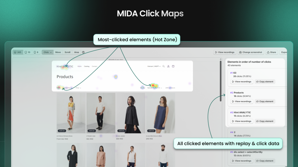
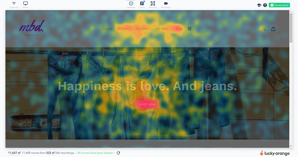
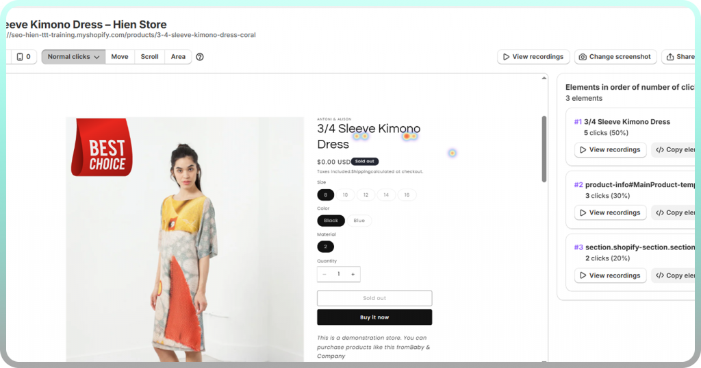
Click heatmaps
Click heatmaps visualize every tap and click on your store, with warmer colors marking high-activity zones and cooler colors showing ignored areas. They’re particularly useful for testing CTA placement, identifying broken links that customers try to click, and discovering distracting elements that steal attention from conversion-critical buttons.
On mobile devices, click heatmaps reveal whether buttons are large enough to tap accurately or if customers accidentally click adjacent elements.
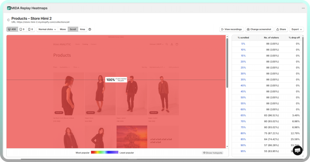
Scroll heatmaps
Scroll heatmaps display how far down each page visitors scroll before leaving, typically shown as percentage bands or color gradients that fade from red at the top to blue at the bottom. The data answers critical questions about content length: are you losing customers before they see your key product benefits, or are you forcing them to scroll through unnecessary content to reach the Add to Cart button?
Most Shopify stores discover that mobile users scroll significantly less than desktop visitors, which means your mobile layout often requires different content prioritization.
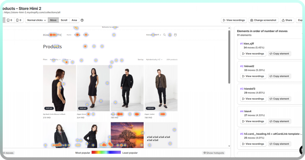
Move heatmaps
Move heatmaps track cursor position as a proxy for visual attention, based on research showing that people tend to look where they move their mouse. The data reveals which page sections draw natural attention versus which get skipped entirely.
However, mouse movement data is less reliable than click or scroll data since some users move their cursor randomly while reading. Look for patterns across many sessions rather than drawing conclusions from individual recordings.
Attention heatmaps
Attention heatmaps combine click, scroll, and movement data into a single unified view that shows overall engagement zones on a page. This composite approach helps you understand the complete picture of how visitors interact with your content rather than analyzing each behavior type in isolation.
How to read a heat map
Before diving into best practices, it helps to understand the fundamentals of heat map interpretation. Even the most sophisticated heatmap tool provides limited value if you’re not reading the data correctly.
Understanding color gradients
The color spectrum in heatmaps follows an intuitive pattern: red and orange indicate high engagement, blue and green show low engagement, and areas with no color received no interaction at all. The “intensity” of a color reflects the concentration of activity—a bright red spot means many visitors clicked or hovered in that exact location.
Keep in mind that color scales are relative to each page. A “hot” zone on a low-traffic page might represent fewer total interactions than a “warm” zone on your homepage.
Identifying hot and cold zones
Hot zones are areas of concentrated activity where visitors click, scroll to, or hover frequently. Cold zones are the opposite—sections that visitors ignore or never reach. The goal isn’t to eliminate all cold zones (some page elements are purely functional), but to ensure your most important content and CTAs sit in hot zones.
Here’s a practical example: if your “Shop Now” button appears in a cold zone while a decorative banner nearby shows high engagement, you’ve identified a layout problem worth fixing.
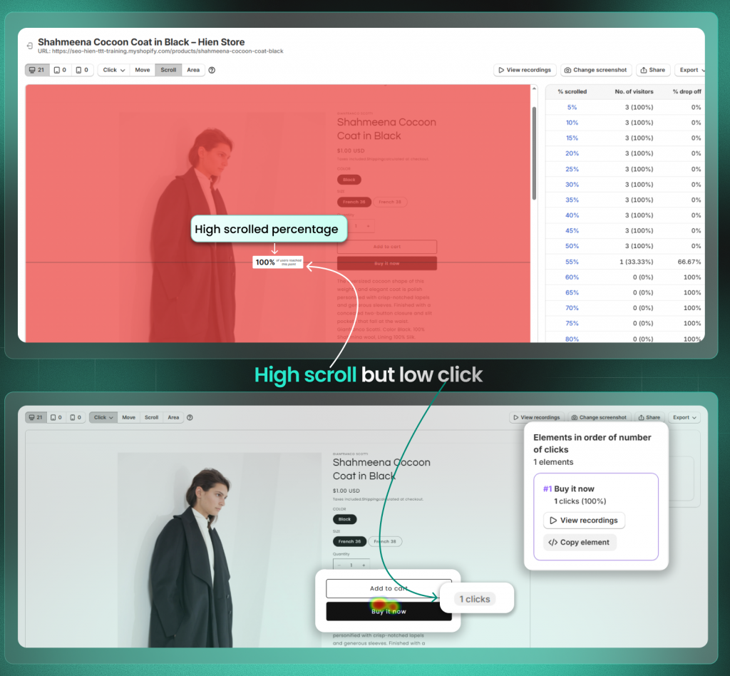
Interpreting click density and scroll depth
Click clusters show where visitors concentrate their attention, but not all clicks are equal. A cluster of clicks on your Add to Cart button indicates healthy engagement, while a cluster on a non-clickable image suggests visitors expected functionality that doesn’t exist.
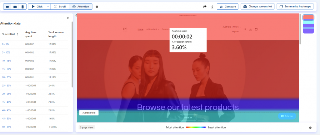
Scroll depth markers typically show what percentage of visitors reached each point on the page. If only 30% of visitors scroll to your product reviews but those reviews are your strongest conversion driver, you’ve found a clear optimization opportunity.
10 best practices for heatmap analysis
The following strategies help you extract meaningful insights from your heat maps quickly. The focus here is on what to look for and what actions to take based on your findings.
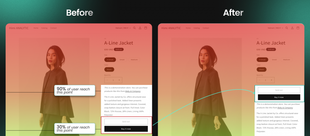
1. Verify users see your most important content
Check scroll maps to confirm that CTAs, pricing, and key messages appear above where most visitors stop scrolling (Above the Average Fold). If critical content sits in a cold zone—meaning few visitors ever see it—consider moving it higher on the page.
This is especially important for mobile visitors, who typically scroll less than desktop users. Your mobile scroll heatmap might reveal that 60% of visitors never see content that 80% of desktop visitors reach.
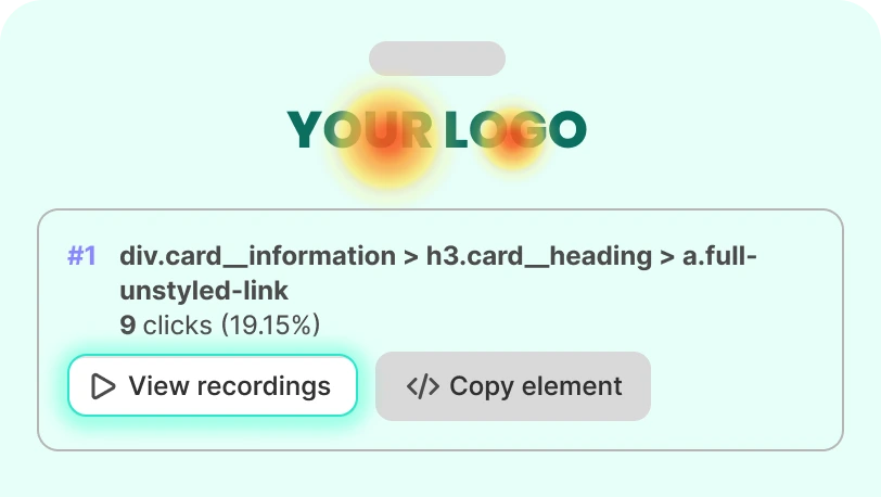
2. Confirm clicks on key page elements
Use click heatmaps to validate that add-to-cart buttons, navigation links, and product options receive engagement. No clicks on a critical element usually means one of two things: visitors don’t see it, or they don’t understand what it does.
A button that looks clickable to you might blend into the background for visitors scanning quickly. Heatmaps reveal visibility problems that are nearly impossible to spot through traditional analytics.
3. Identify dead clicks on non-clickable elements
Dead clicks occur when visitors click on images, text, or icons that aren’t actually linked to anything. These clicks reveal user expectations your design isn’t meeting—visitors thought something would happen, and nothing did.
Common dead click patterns include:
- Product images that visitors expect to zoom or enlarge
- Text that looks like a link but isn’t hyperlinked
- Icons that appear interactive but serve only as decoration
- Headings that visitors assume will expand or navigate somewhere
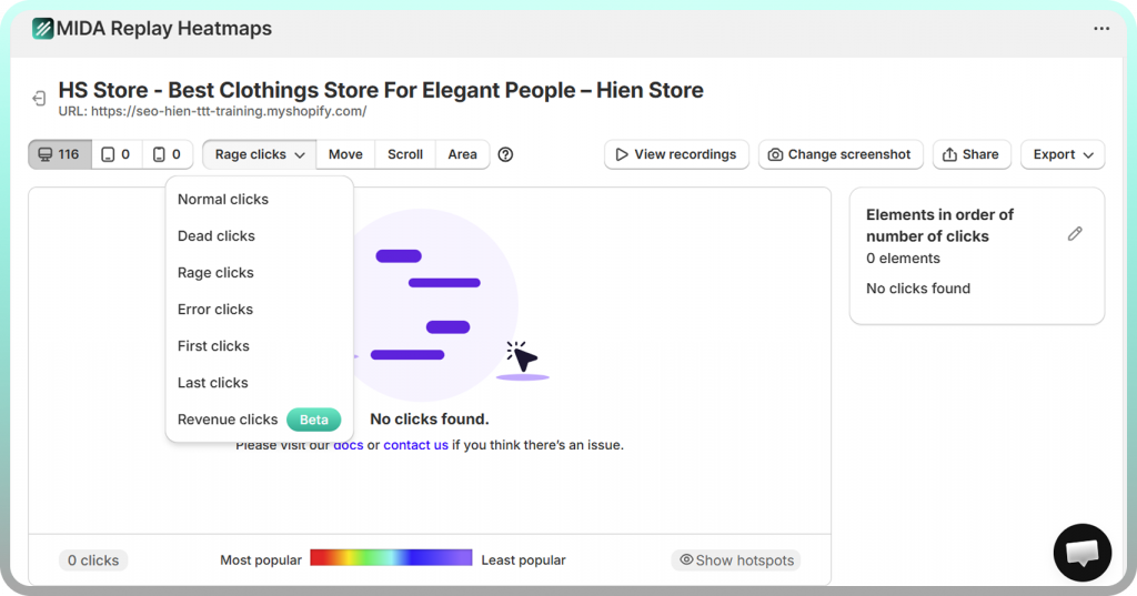
4. Spot rage clicks that signal frustration
Rage clicks are repeated rapid clicks in one spot, typically indicating that something isn’t working as expected. These might signal broken elements, slow-loading buttons, or confusing interactions that frustrate visitors enough to click repeatedly.
Tools like MIDA heatmap, session replays automatically surface rage clicks in session recordings, so you don’t have to manually hunt through heatmap data to find frustration signals.
5. Find distracting elements that pull attention away
Sometimes the problem isn’t that your CTA is invisible—it’s that something else is stealing attention. Identify areas that attract clicks but don’t contribute to conversions, such as decorative banners, secondary links, or promotional badges that compete with your main call-to-action.
If a non-essential element receives more clicks than your Add to Cart button, consider removing it, moving it, or reducing its visual prominence.
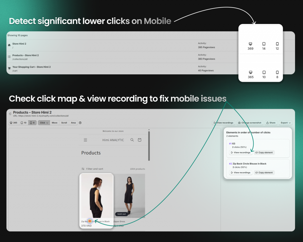
6. Compare mobile and desktop behavior separately
Always segment heat maps by device type. Mobile shoppers scroll and tap differently than desktop users, and what works on one platform often fails on the other. A layout that converts well on desktop might hide critical content below the fold on mobile.
| Behavior | Desktop Users | Mobile Users |
| Scroll depth | Typically scroll further | Often stop earlier |
| Click precision | More accurate | May tap wrong elements |
| Reading patterns | More thorough | More scanning |
7. Segment by traffic source or campaign
Visitors from different sources often behave differently on the same page. Someone arriving from a Google search might have different intent than someone clicking through from an Instagram ad. Filter heatmaps by ad campaign, referral source, or landing page to understand behavioral differences.
This segmentation is particularly valuable for paid campaigns. If traffic from a specific ad shows unusual behavior patterns—like high rage clicks or early scroll abandonment—you might have a mismatch between ad messaging and landing page content.
8. Combine click and scroll data for full context
Layer multiple heat map types to get the complete picture. A high-click element below the fold matters less if few visitors scroll there. Conversely, a section with high scroll-through rates but no clicks might indicate content that’s interesting but lacks a clear next action.
The combination reveals optimization opportunities that neither data type shows alone.
9. Use session replay to investigate anomalies
When heatmaps reveal unexpected patterns—like a cluster of clicks in an empty area or unusually low scroll depth on a short page—session recordings help you understand the “why” behind the behavior. Watching individual visitor journeys provides context that aggregate heatmap data cannot.
Shopify-native tools like MIDA combine heatmaps and session replay in one platform, making it easy to jump from a heatmap anomaly directly to relevant recordings without switching between disconnected tools.
Tip: When you spot an unusual pattern in your heatmap, filter your session recordings to show only visitors who interacted with that specific element. This targeted approach saves hours compared to watching random recordings.
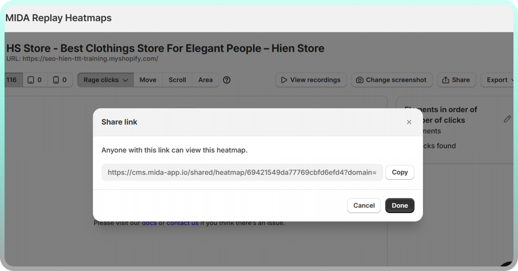
10. Share heat map findings with your team
Export or screenshot heatmaps to communicate insights to developers, designers, and stakeholders. Visual evidence builds consensus for changes far more effectively than verbal descriptions or data tables.
A heatmap showing that 70% of visitors never scroll to your product reviews is immediately understandable to anyone on your team, regardless of their analytics expertise.
Heat map examples for ecommerce pages
The following examples show how heat mapping reveals actionable insights on common Shopify store pages. Each page type presents unique patterns worth understanding.
Product page heatmap example
On a typical product page, you’ll often see clicks concentrated on the main product image (visitors expecting zoom functionality), with scroll drop-off occurring before reviews and detailed specifications. Dead clicks frequently appear on size guide text that looks like a link but isn’t.
Actions to consider: move your most compelling product benefits above the average scroll depth, ensure product images support zoom or gallery functionality, and hyperlink any text that visitors expect to be clickable.
Cart page heatmap example
Cart pages typically show engagement around quantity selectors and product thumbnails, with cold zones around upsell modules that visitors scroll past quickly. Rage clicks often appear on checkout buttons during slow page loads or when discount codes fail to apply.
The cart page is also where you’ll see hesitation patterns—visitors hovering over shipping estimates or clicking between cart and product pages, suggesting they want more information before committing.
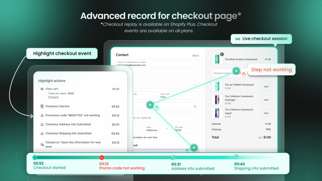
Checkout flow heatmap example
Checkout heatmaps reveal hesitation around shipping address fields, clicks on trust badges and security icons, and drop-off points in multi-step checkout processes. Form fields that trigger repeated clicks or long hover times often indicate confusion about what information is required.
Note that tracking Shopify checkout pages requires tools specifically built for the platform. Standard heatmap tools cannot access Shopify’s checkout, but Shopify-native apps like MIDA can track behavior through the entire checkout flow.
Common heatmap analysis mistakes to avoid
Even with good data, certain errors lead to wrong conclusions or missed opportunities. Being aware of the following pitfalls helps you extract more accurate insights from your heatmaps.
Relying on small sample sizes
Heatmaps require sufficient visitor volume to show reliable patterns. Viewing a heatmap after only 50 sessions produces misleading results—you might see a “hot zone” that’s actually just three visitors who happened to click in the same area.
Wait until you’ve collected at least 200-300 sessions per page before drawing conclusions. For pages with lower traffic, this might mean waiting a week or more before the data becomes meaningful.
Ignoring mobile traffic
Analyzing desktop-only data when mobile represents the majority of your traffic leads to optimization decisions that help a minority of visitors while potentially hurting the majority. Always check both device types, and prioritize mobile insights if that’s where most of your traffic comes from.
Analyzing without visitor context
Raw aggregate data hides important variations between visitor segments. First-time visitors behave differently than returning customers. Traffic from paid ads behaves differently than organic search traffic. Drawing conclusions from combined data can mask critical patterns.
Segment your heatmaps by visitor type, traffic source, or purchase intent to reveal hidden variations.
Overlooking rage and error clicks
Standard click heatmaps may not highlight frustrated behavior—they simply show where clicks occurred, not whether those clicks indicated satisfaction or frustration. Use tools that automatically surface rage clicks and error clicks so you can identify and fix friction points quickly.
How to connect heat map insights to revenue
The ultimate goal of heatmap analysis isn’t just understanding behavior—it’s improving business outcomes. Connecting behavioral signals to conversion metrics transforms interesting observations into actionable priorities.
Traditional heatmap tools show where users click, but they don’t tell you whether those clicks led to purchases. Shopify-native tools like MIDA connect heatmap data directly to cart and order information, so you can see which behaviors correlate with revenue.
| Traditional Heatmap Tools | Shopify-Native Heatmap Tools |
| Show where users click | Connect clicks to cart additions and orders |
| Display scroll depth | Link scroll behavior to purchase completion |
| Track all visitors equally | Segment by buyer vs. non-buyer |
This revenue connection changes how you prioritize optimizations. A “cold zone” on a page section that buyers consistently reach matters less than a cold zone that’s causing non-buyers to leave. When you can filter heatmaps by purchase outcome, you focus on changes that actually impact your bottom line.
Turn heatmap insights into higher conversions
Heatmap analysis works best as an ongoing practice rather than a one-time audit. Customer behavior shifts as you update your store, launch new products, and run different campaigns. Regular heatmap reviews help you catch emerging friction points before they significantly impact revenue.
Start with your highest-traffic pages—typically your homepage, top product pages, and cart page. Once you’ve addressed major issues on high-traffic pages, expand your analysis to category pages, landing pages, and checkout flows.
The most valuable approach combines heatmaps with session replays and qualitative feedback. Seeing where customers click matters less if you don’t understand why they clicked there or what they expected to happen.
Try MIDA free to see how Shopify merchants use heatmaps, session replay, and revenue-connected analytics to improve conversions.
FAQs about heatmap analysis
How many visitor sessions are needed for reliable heatmap data?
You typically want at least 200-300 sessions per page before drawing conclusions. Smaller sample sizes produce patterns that might be random noise rather than meaningful behavior. For major decisions like redesigning your checkout flow, waiting for 500+ sessions provides more confidence in your findings.
How often should ecommerce stores review their heatmaps?
Review heatmaps after any significant page change, new campaign launch, or traffic spike. For stable pages that haven’t changed recently, a monthly review keeps insights current without creating unnecessary work.
Can heatmap tools track Shopify checkout pages?
Standard heatmap tools cannot access Shopify’s checkout because it’s hosted on a separate domain with restricted access. Shopify-native apps like MIDA can track behavior through the entire checkout flow, including payment and confirmation steps that generic tools miss entirely.
What is the difference between heatmaps and session replay?
Heatmaps aggregate behavior from all visitors into a single visual summary, showing patterns across your entire audience. Session replay lets you watch individual visitor journeys in real time to understand specific actions, hesitations, and frustrations. The two work best together—heatmaps identify what is happening, and session replays explain why.


