15 Proven Strategies to Improve Ecommerce Conversion Rates in 2026
Your store gets traffic, but visitors leave without buying. That gap between visits and purchases is where revenue disappears—and where most optimization efforts either succeed or waste time.
This guide covers what ecommerce conversion rate actually means, how to calculate yours, what benchmarks to compare against, and 15 specific strategies that move the needle.
What is ecommerce conversion rate
Ecommerce conversion rate is the percentage of visitors who complete a purchase on your store. If 100 people visit and 3 buy, your conversion rate is 3%. Average rates hover between 2% and 4%, though top-performing stores often exceed that range.
The math is simple, but the implications matter. Moving from 2% to 3% means 50% more revenue from the same traffic. That’s why small improvements in conversion often outperform efforts to drive more visitors.
How to calculate your ecommerce conversion rate
The formula: (Number of Purchases ÷ Total Visitors) × 100.
So 150 purchases from 5,000 visitors equals a 3% conversion rate. You can pull this data from Shopify analytics, Google Analytics, or behavior analytics tools that track visitor journeys alongside purchase outcomes.
One thing to watch: some tools count sessions (total visits) while others count unique visitors. The numbers differ, so pick one method and stick with it for accurate comparisons over time.
What is a good ecommerce conversion rate
“Good” depends entirely on context. The global average sits between 2.5% and 3%, but that number hides enormous variation by industry, device, and traffic source.
The more useful question isn’t “Is my rate good?” but “Is my rate improving?” Your own baseline matters more than industry averages. A store converting at 1.5% that improves to 2% has made real progress, even if both numbers fall below average.
Average conversion rate by industry
Different products convert at different rates. Food and grocery stores often see higher conversion because purchases are routine. Luxury goods convert lower because buyers take more time to decide.
| Industry | Typical Range |
|---|---|
| Food & Grocery | 4–6% |
| Health & Beauty | 3–4% |
| Fashion & Apparel | 2–3% |
| Electronics | 1.5–2.5% |
| Luxury & Jewelry | 1–1.5% |
Use these as rough guides, not hard targets. Price point, brand recognition, and customer type all shift the numbers.
Average conversion rate by device
Desktop visitors typically convert at higher rates than mobile—often 1.5 to 2 times higher. Part of this comes from easier browsing on larger screens. Part comes from mobile visitors being in earlier research stages.
However, mobile traffic volume usually exceeds desktop. If your mobile conversion rate lags significantly behind desktop, that gap represents recoverable revenue worth investigating.
Average conversion rate by traffic source
Where visitors come from shapes how likely they are to buy:
- Direct traffic: People who type your URL already know you, so conversion tends to be higher
- Email: Warm audiences who opted in typically convert well
- Organic search: Varies by intent—brand searches convert differently than generic product searches
- Paid ads: Depends on targeting quality and landing page relevance
- Social media: Often lower intent, with people browsing rather than shopping
Segmenting conversion by traffic source reveals which channels bring buyers versus browsers.
15 ecommerce conversion optimization strategies
Each of the following addresses common friction points that stop visitors from buying. The focus is reducing friction, building trust, and improving clarity.
1. Simplify your checkout process
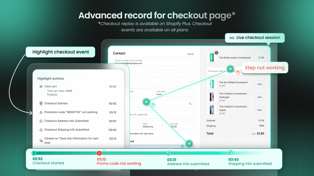
Every extra step or form field in checkout is a potential exit point. Friction signals include repeated back-button clicks, long pauses on payment fields, and visitors who start checkout but never finish.
If your abandoned checkout rate is high, the checkout flow itself is often the problem.
2. Enable guest checkout
Forcing account creation before purchase is one of the most common conversion killers. Many first-time buyers want to complete their purchase quickly.
Offering account creation after purchase—or making it optional—removes a barrier that stops people mid-transaction.
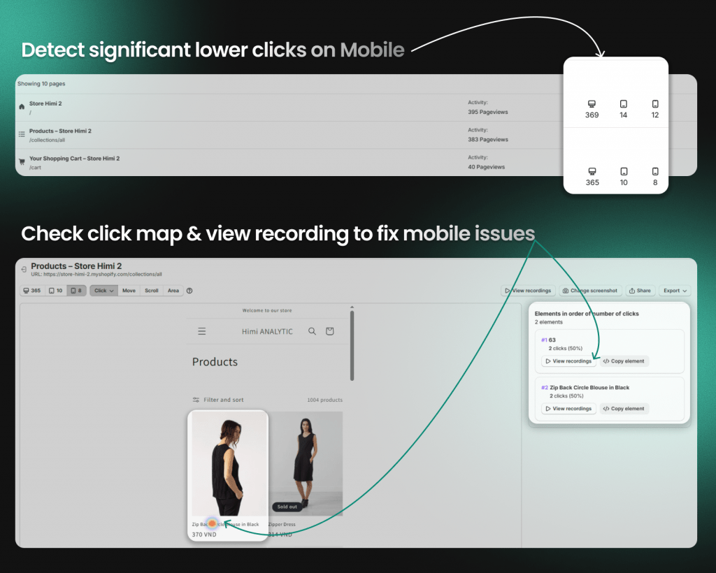
3. Optimize your mobile shopping experience
Mobile users have different needs: larger tap targets, simplified navigation, thumb-friendly button placement. What works on a 27-inch monitor often fails on a 6-inch screen.
Friction signals on mobile include pinch-to-zoom on product images, mis-taps on closely spaced elements, and horizontal scrolling.
4. Improve site speed and page load times
Slow pages cause visitors to leave before seeing your products. Each additional second of load time increases abandonment likelihood.
Focus on the pages that matter most: homepage, collection pages, product pages, and checkout. A fast blog page matters less than a fast product page.
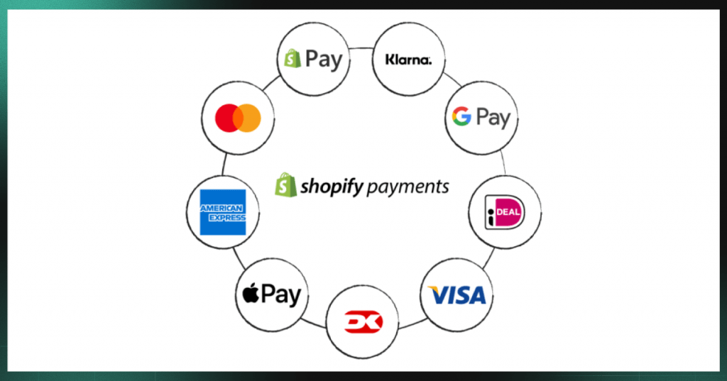
5. Add multiple payment options
Limited payment options create friction at the final step. Different customers prefer different methods:
- Credit and debit cards
- PayPal and digital wallets
- Buy-now-pay-later services like Shop Pay Installments, Klarna, or Afterpay
- Apple Pay and Google Pay for mobile
The more ways people can pay, the fewer reasons they have to leave.
6. Display trust badges and security seals
Unfamiliar stores face a trust barrier. Visitors wonder: Is this site legitimate? Will my payment information be safe?
Trust signals help answer those questions. Place them near add-to-cart buttons, on the cart page, and throughout checkout. Examples include SSL certificates, payment provider logos, and money-back guarantee badges.
7. Add customer reviews and social proof
Shoppers look for validation from other buyers before purchasing. Reviews reduce uncertainty by showing that real people bought the product and were satisfied.
Place reviews on product pages near the buy buttonPlace reviews on product pages near the buy button—heatmaps can confirm whether visitors actually see them. Use star ratings on collection pages. Interestingly, handling negative reviews well can actually build trust—it shows transparenc
8. Use high-quality product images and videos
Online shoppers can’t touch or try on products. Images and videos do that work instead.
Provide multiple angles, zoom functionality, and lifestyle shots showing products in use. Product videos demonstrating size or texture can significantly reduce purchase hesitation.
9. Write clear and compelling product descriptions
Descriptions answer the questions shoppers have before buying: What is this made of? How big is it? Will it work for my situation?
Focus on benefits over features. Include sizing, dimensions, and materials. Unclear descriptions lead to hesitation—or returns from customers who didn’t get what they expected.
10. Make site navigation intuitive
Visitors who can’t find products can’t buy them. Confusing navigation is surprisingly common.
Use a clear category structure, effective search functionality, and breadcrumbs showing visitors where they are. Friction signals include repeated searches for the same term and excessive back-button usage.
11. Use exit-intent popups and incentives
Exit-intent technology detects when a visitor is about to leave by tracking cursor movement toward the browser’s close button. At that moment, you can display a popup offering a discount or capturing an email.
Use this sparingly. One well-timed offer to a leaving visitor is helpful. Constant interruptions are not.
12. Recover abandoned carts with email and SMS
Many visitors add items to their cart but don’t complete the purchase. This is recoverable revenue.
Send recovery messages within a few hours of abandonment. Show the abandoned items, address common objections like shipping costs, and consider offering a small incentive.
13. Add urgency with limited-time offers
Urgency motivates action when shoppers are on the fence. A deadline creates a reason to buy now rather than “later.”
Use authentic urgency: real sale deadlines or genuinely limited inventory. Avoid fake urgency like countdown timers that reset on page refresh—customers notice, and false urgency damages trust.
14. Provide size guides and product details
Uncertainty about fit is a major purchase barrier, especially for apparel and furniture. Customers who aren’t sure if something will fit often don’t buy—or buy and return.
Provide detailed size charts, comparison tools, and specific dimensions. For apparel, include model measurements and the size they’re wearing.
15. Test and validate every change
A/B testing shows different versions of a page to different visitors to see which performs better. It moves you from “I think this will work” to “I know this works.”
Assumptions about what improves conversion are often wrong. The button color you’re sure will perform better might not. Data guides better decisions than intuition.
Tip: Session recordings can show you why a test variant works or doesn’t. Numbers tell you which version won; watching real visitor behavior shows what caused the difference.
Common ecommerce conversion rate mistakes to avoid
Even well-intentioned optimization efforts can backfire. The following mistakes hurt conversion rates more often than merchants realize.
Ignoring mobile user experience
Many stores optimize for desktop while most traffic comes from mobile. A beautiful desktop site with frustrating mobile experience—tiny buttons, slow load times, difficult forms—kills conversions where most visitors actually are.
Overcomplicating the checkout flow
Adding “helpful” features often adds friction instead. Unnecessary upsells, too many form fields, or surprise costs at the final step all increase abandonment.
The goal is removing obstacles, not adding features.
Making changes without watching real user behavior
Analytics show what happened—drop-off at checkout, high bounce rate—but not why. Without understanding the cause, fixes are guesswork.
Session recordings, heatmaps, and click analysis reveal the specific moment and element causing friction. You might discover visitors aren’t abandoning because of price—they’re abandoning because a form field throws an error they can’t resolve.
Neglecting page speed on key landing pages
Speed optimization often focuses on the homepage while paid traffic lands on product or collection pages. If your ads send visitors to slow-loading pages, you’re paying for traffic that leaves before seeing your products.
How to find where customers drop off in your funnel
The conversion funnel is the path from first visit to completed purchase: product view → add to cart → checkout initiated → purchase complete. Each step has drop-off.
Finding the biggest leaks—the steps where you lose the most potential buyers—tells you where to focus:
- Funnel visualization: See which step loses the most visitors. If 1,000 people view products but only 100 add to cart, that 90% drop-off is worth investigating.
- Heatmaps: Identify which page elements get ignored or cause confusion. A heatmap might reveal visitors never scroll far enough to see your add-to-cart button.
- Session recordings: Watch actual visitor journeys to see the specific moment they leave. Instead of guessing why checkout abandonment is high, you can watch visitors encounter the exact friction point.
Tools like MIDA connect funnel data directly to session recordings. You can click from a drop-off metric straight into the recordings where that abandonment happened—seeing not just that visitors left, but what they experienced before leaving.
See your store through your customers’ eyes
Guessing why visitors don’t buy leads to wasted effort. You might spend weeks optimizing the wrong page while the real friction point goes unaddressed.
When you can see exactly where customers click, hesitate, and leave, you stop optimizing blind. You fix what actually blocks revenue instead of what you assume blocks revenue.
Numbers tell you something went wrong. Watching real sessions shows you what.
Try MIDA for free to see how connecting behavior to revenue changes the way you optimize your store.
FAQs about ecommerce conversion rates
What is the 80/20 rule in ecommerce?
The 80/20 rule (Pareto Principle) suggests roughly 80% of your revenue comes from 20% of your customers or products. In conversion optimization, this means focusing on the highest-impact pages and friction points rather than trying to fix everything at once.
Is a 2.5 percent conversion rate good for ecommerce?
A 2.5% rate falls within the typical range, but “good” depends on your industry, traffic sources, and price point. Luxury goods might convert at 1% while grocery stores see 5%+. The more useful question is whether your rate is improving over time.
What is the difference between micro conversions and macro conversions?
Macro conversions are your primary goal—usually completed purchases. Micro conversions are smaller actions indicating progress: email signups, add-to-carts, account creation. Tracking micro conversions helps identify where visitors drop off before reaching the final purchase.
How long does it take to see results from ecommerce conversion optimization?
Timeline depends on traffic volume and the changes you make. High-traffic stores may see measurable results within days. Lower-traffic stores need weeks to gather statistically meaningful data. Sustained improvement typically requires ongoing testing rather than one-time fixes.


