10 Ecommerce Conversion Killers Costing You Sales in 2026
Your traffic looks healthy, your products are priced right, and your ads are driving clicks—but sales aren’t following. Something on your site is stopping shoppers from buying, and standard analytics won’t tell you what.
These invisible friction points are conversion killers: the slow pages, hidden fees, confusing navigation, and missing trust signals that quietly drain revenue. This guide covers the ten most common conversion killers on ecommerce stores, how to identify them using real shopper behavior, and what to fix first.
What are ecommerce conversion killers
Ecommerce conversion killers are friction points that stop visitors from completing a purchase. Slow page speeds, hidden shipping costs, forced account creation, poor mobile optimization, and missing trust signals all fall into this category. When shoppers encounter friction, they leave—and your revenue disappears with them.
Most conversion killers fit into four buckets: speed problems, trust gaps, usability failures, and information gaps. The frustrating part? Store owners rarely see the friction because they’ve tested their own checkout dozens of times. First-time visitors on mobile, though, are abandoning because a button doesn’t respond or shipping costs appear too late.
Slow page load speed
How slow speed drives shoppers away
Every second of waiting increases impatience. Shoppers often equate slow sites with unreliable businesses—if your page takes too long to load, they assume your checkout or shipping will be equally frustrating. The result is lost revenue before visitors even see your products.
How to find your slowest pages
Google PageSpeed Insights reveals which pages drag. Focus on pages where buying intent is highest:
- Homepage: First impressions happen here
- Collection pages: Often image-heavy and slow to render
- Product pages: Where purchase decisions happen
- Cart and checkout: Where abandonment costs the most
Session replays can also show the exact moment shoppers leave during a long page load—you’ll see the cursor stop moving, then the session ends.
Quick fixes for faster load times
Compress images before uploading, reduce the number of apps running on your store, and implement lazy loading so images only load as shoppers scroll to them. Auditing your theme’s code for unnecessary scripts helps too. Even shaving one second off load time can improve conversion rates.
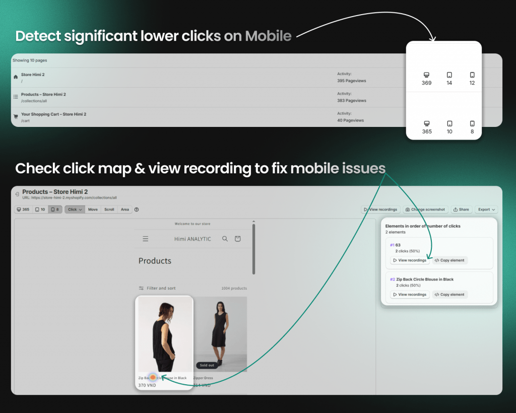
Poor mobile experience
Why mobile shoppers abandon faster
Mobile shoppers have less patience and more distractions. Small screens amplify every UX flaw—tiny buttons, hard-to-read text, awkward forms—and mobile users abandon faster than desktop visitors facing the same issues.
Common mobile UX failures
- Tap targets too small: Buttons and links that are hard to press accurately
- Horizontal scrolling: Content extending beyond the screen width
- Unreadable text: Font sizes requiring pinching to zoom
- Slow-loading images: Large files not optimized for mobile connections
- Forms that fight thumbs: Input fields difficult to complete on mobile keyboards
How to audit your mobile store
Test your store on actual mobile devices, not just browser emulators. Watch mobile session replays to see real shopper struggles—you’ll notice behaviors like repeated taps on unresponsive elements or long pauses on forms. Heatmaps reveal where mobile taps fail, showing rage clicks (rapid frustrated clicking) or dead clicks (taps on non-clickable elements).
Confusing store navigation
Signs your navigation is broken
Behavioral signals tell you when navigation fails. Shoppers clicking the same menu repeatedly, using search instead of browsing, or bouncing from collection pages quickly all point to navigation problems. “Pogo-sticking”—when users go back and forth between pages because they can’t find what they want—is another clear warning sign.
How to simplify your menu structure
Limit top-level categories to prevent overwhelm. Use clear, descriptive labels instead of clever or branded ones—”Women’s Shoes” works better than “Her Sole Story.” Adding breadcrumbs helps shoppers orient themselves and backtrack without frustration.
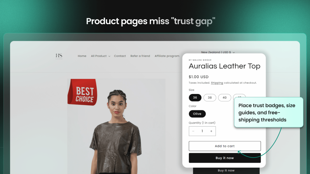
Missing trust signals
Trust elements shoppers expect
First-time visitors are skeptical by default. They’re evaluating whether your store is legitimate before entering payment information.
- Security badges: SSL certificates, secure checkout indicators
- Payment icons: Recognized logos for credit cards, PayPal, Shop Pay
- Contact information: Phone number, email, physical address
- Clear return policy: Easy to find, easy to understand
- Customer reviews: Social proof that others have purchased successfully
Where to place trust badges
Trust signals work best when they’re visible at decision-making moments. Place badges near add-to-cart buttons, in your site footer, and prominently on checkout pages. Burying your return policy on a separate page that requires three clicks to find defeats the purpose.
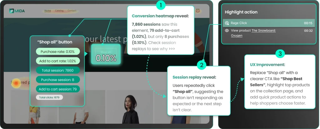
Weak or misplaced CTAs
Why your CTAs fail to convert
A CTA (call-to-action) is a prompt designed to get an immediate response—”Add to Cart,” “Buy Now,” “Shop the Collection.” CTAs often fail due to vague language (“Submit”), placement below the fold where shoppers don’t scroll, or too many competing CTAs that create decision paralysis.
Dead clicks on non-clickable elements that look like buttons are another signal. If shoppers are clicking on something expecting it to be a CTA, you’ve created confusion.
How to test CTA placement and copy
Heatmaps show whether your CTAs are getting clicks or being ignored. A/B testing different language helps find what resonates—sometimes small changes like “Add to Cart” versus “Buy Now” make measurable differences.
| Weak CTA | Stronger CTA | Why it works |
|---|---|---|
| Submit | Add to Cart | Action-specific and familiar |
| Click Here | Shop the Collection | Describes what happens next |
| Learn More | See How It Fits | Benefit-oriented |
Complicated checkout process
Checkout friction that causes abandonment
Checkout abandonment happens when shoppers start the checkout process but don’t complete it. Common friction points include mandatory account creation, too many form fields, no guest checkout option, unclear progress indicators, and confusing error messages.
How to streamline your checkout flow
Offer guest checkout, enable browser autofill, use a progress indicator, and minimize form fields to only what’s essential. Watching checkout session replays reveals the exact moments shoppers abandon—long pauses before a specific field, repeated typing to correct errors, or back-button clicks that signal confusion.
Surprise costs at checkout
Why hidden fees kill conversions
Shoppers feel deceived when the total price jumps unexpectedly. Shipping costs, taxes, and fees added late in the process trigger immediate abandonment. This isn’t just frustration—it feels like a violation of trust, and shoppers rarely return after that experience.
How to show costs upfront
Include a shipping calculator on product pages so shoppers know costs before they commit. Display free shipping thresholds prominently. Use tax-inclusive pricing where possible. Your cart page can show the complete total before shoppers proceed to checkout—no surprises at the final step.
Insufficient product information
What shoppers need before buying
Since shoppers can’t touch or try products online, your descriptions replace that physical experience.
- Dimensions and weight: Especially for furniture, decor, shipped goods
- Materials and ingredients: Builds quality perception
- Sizing information: Charts, fit guides, comparison to common items
- Use cases: How the product fits into the shopper’s life
- Compatibility: What it works with, what it replaces
How to write product descriptions that sell
Write benefit-led copy that answers “why does this matter to me?” Use scannable formatting—bullets, short paragraphs, bold key points. Proactively address common objections. Customer surveys can reveal which questions your current descriptions leave unanswered.
Poor product imagery
Image mistakes that hurt sales
Images are often the first thing shoppers evaluate. Common mistakes include using only a single image, low-resolution photos, inconsistent backgrounds across your catalog, no scale reference, and missing lifestyle shots that show the product in context.
Product photo best practices for ecommerce
- Multiple angles: Front, back, side, detail shots
- Zoom capability: Let shoppers inspect quality
- Scale reference: Show size relative to common objects or people
- Lifestyle context: Product in use, not just on white background
- Consistent styling: Same lighting and backgrounds across your catalog
Missing social proof and reviews
Types of social proof that drive conversions
Social proof is evidence that others trust your store.
- Customer reviews: Written feedback with star ratings
- User-generated photos: Real customers showing products in use
- Testimonials: Highlighted quotes from satisfied buyers
- Trust badges: “As seen in” or certification logos
- Purchase activity: Recent orders or “X people viewing this”
Where to display reviews for maximum impact
Display reviews on product pages near the price and CTA—that’s where the buying decision happens. Show star ratings on collection pages so shoppers can quickly compare options. Feature testimonials on your homepage to build trust before visitors even reach product pages.
How to find conversion killers on your store
Knowing what conversion killers look like is one thing. Finding them on your own store requires moving from guesswork to evidence.
Using session replays to spot friction
Session replays let you watch recordings of real shoppers navigating your store. Look for behavioral signals like long pauses (confusion at a specific element), repeated clicks (something isn’t working), rage clicks (rapid frustrated clicking on unresponsive elements), back-button loops (shoppers can’t find what they want), and form abandonment.
Shopify-native session replay tools like MIDA can show customer profiles linked to orders and abandoned carts, so you can watch the exact session behind each outcome.
Reading heatmaps to find dead zones
Heatmaps show aggregate behavior across many visitors, revealing where shoppers click, scroll, and ignore. Use them to find “dead zones”—page areas with important content that get no interaction. Click-type heatmaps distinguish between normal clicks, dead clicks, rage clicks, and error clicks, helping you identify specific problems.
Connecting customer feedback to behavior
Surveys capture the “why” behind shopper behavior. Pair survey responses with session replays to see the full context—some tools link responses directly to recordings so you can watch the session behind each answer.
Tip: Start by watching sessions from shoppers who abandoned checkout. High-intent visitors were close to purchasing, so the friction that stopped them likely represents your biggest revenue opportunity.
Stop guessing and fix what actually blocks revenue
Identifying conversion killers requires seeing real shopper behavior, not making assumptions about what might be wrong. The difference between stores that improve conversion rates and stores that don’t often comes down to visibility—can you see where shoppers struggle, or are you guessing?
Tools built specifically for Shopify give you context that general analytics miss: customer profiles, order history, cart values, and checkout behavior all connected to the sessions where friction occurred. When you can click from a funnel drop-off straight into the session replay where that abandonment happened, you stop guessing and start fixing.
Try MIDA for free to see how connecting behavior to revenue changes the way you optimize.
FAQs about ecommerce conversion killers
What is a good ecommerce conversion rate?
A healthy ecommerce conversion rate varies by industry and traffic source, but most stores see rates between two and four percent. Focus less on benchmarks and more on improving your own rate over time by fixing friction points—a store converting at 1.5% that improves to 2% has increased revenue by 33%.
Which ecommerce conversion killer should I fix first?
Start with the issue affecting the most shoppers at the highest-intent stage—usually checkout friction or surprise costs. Fixing problems closest to purchase has the fastest impact on revenue because visitors at that stage were already ready to buy.
How long does it take to see results after fixing a conversion killer?
You can often see changes within days if traffic is steady, but allow a few weeks to confirm the improvement is consistent. Smaller stores may need more time to gather statistically meaningful data.
How do I measure whether fixing a conversion killer actually worked?
Compare your conversion rate before and after the change, and watch for reduced drop-offs at the specific funnel step you fixed. Session replays can confirm shoppers are no longer struggling at that point—you’ll see smoother journeys through the area you optimized.


