Turn Heatmaps into Product Page Wins with MIDA

A heatmap is just a pretty picture until you use it to move a button, rewrite a headline, or hide a section that no one cares about. To truly optimize your store, remember: Heatmaps only matter when you act on them.
Here is how to translate visual data into more sales.
How to Read Your Heatmaps (The Quick Way)
- Click vs. Scroll: Intent vs. Exposure
- Click Maps show you Intent: They reveal what visitors want to interact with, including “Dead Clicks” on non-link elements that users mistake for buttons.
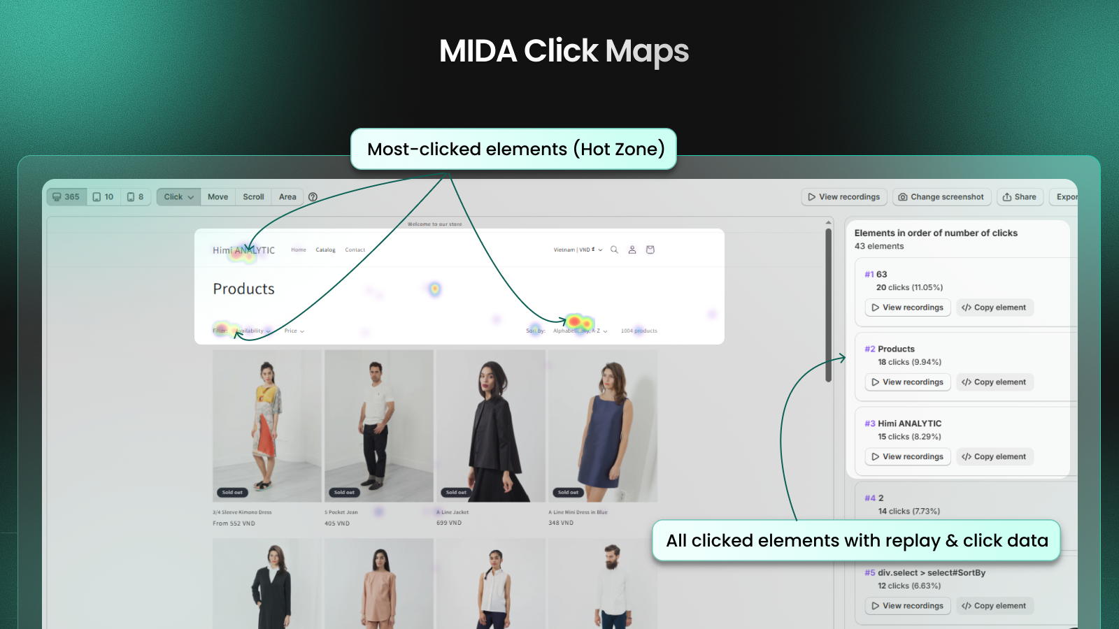
- Scroll Maps show you Exposure: Scroll maps and average fold lines show exactly how far customers scroll and what they actually see. If your best USPs are in a “cold” blue zone, they might as well not exist. Based on this insight, you can move critical CTAs, pricing, and reassurance content where shoppers will notice.

- Attention vs. Expectation
- Use Move Maps (Hover/Attention maps) to see where users linger.
- The Big Question: Does the “hot” zone on your map match the most important part of your page? If users are hovering over an image but you want them to click a “Buy Now” button that is sitting in a “cold” zone, you have a mismatch between visitor attention and your business expectations.

Product Page Optimization Checklist
Based on MIDA’s best practices, check these three areas immediately:
- CTA Visibility: Use the Average Fold line in your Scroll Map to see what is visible before a user starts scrolling. Your primary “Add to Cart” CTA should be highly visible here, or better yet, made into a sticky CTA on mobile.
- USP Placement: Identify your “warmest” areas for scrolling and movement. Place your benefit bullets, size guides, and shipping thresholds in these high-traffic zones to resolve doubts instantly.
- Reviews & Trust Signals: Check your Scroll Map to see if users actually reach your review section. If only 10% of users scroll that far, move a “Star Rating” and one “Featured Review” directly under your product title.
Before vs. After: A Real-World Win
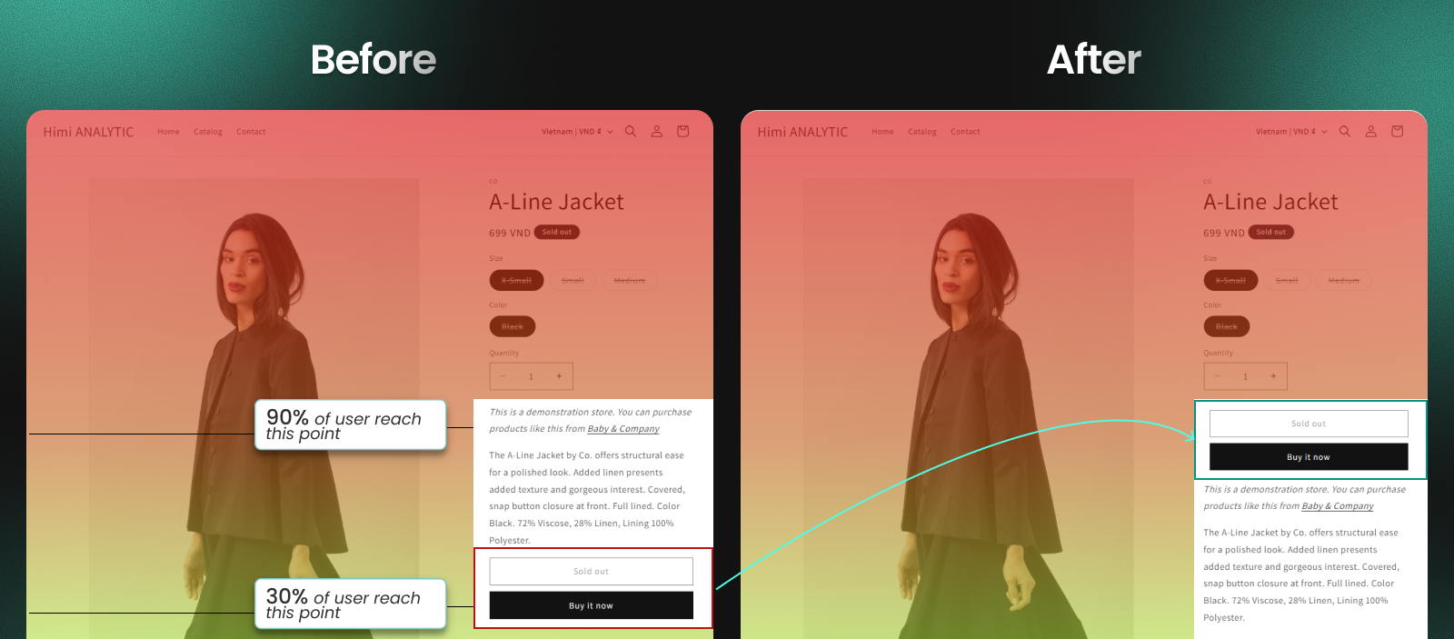
- Before: A store had a long product description at the top. The Scroll Map showed that 70% of visitors dropped off before reaching the “Add to Cart” button, which was located at the very bottom.
- The Action: The merchant moved the “Add to Cart” button above the Average Fold line and placed the 3 most important product benefits (USPs) next to it.
- After: The Click Map showed a 25% increase in “Add to Cart” events, and the Conversion Funnel in Analytics showed fewer drop-offs between “Product Viewed” and “Cart Added”.
Don’t let your data go to waste. Open your most popular product page and see where your customers are actually looking.
👉 Open your top product heatmap
Expert UX Recommendations for Your Product Page
Beyond just reading the maps, here are specific UX recommendations drawn from MIDA’s data to boost your conversion rate:
- Mobile-First Prominence: Ensure your primary CTA (Add to Cart) and navigation buttons are thumb-friendly and responsive. On mobile, use a Sticky Add to Cart button so the option to buy is always present, regardless of scroll depth.
- Reduce “UI Noise”: Minimize pop-ups or aggressive upsells that block the path to checkout. Use Session Replays to check if a “mini-cart” or side drawer is obscuring the “Proceed to Checkout” button.
- Message Alignment: Ensure the ad messaging that brought the visitor to the page matches the landing content. A mismatch here is the #1 cause of high bounce rates.
- Information Near the Button: Place critical decision-making info—like returns policy, warranty badges, or variant selection—directly next to the CTA. This reduces the need for users to hunt for information, which often leads to them leaving the site.
- Streamlined Navigation: Keep your top menu concise with clear category entry points. If heatmaps show users are clicking all over your header but not on products, your navigation might be too confusing
Analogy: If your store was a physical boutique, a Heatmap would be like looking at the floor after a busy day. The scuff marks (Clicks) tell you where people stood the most, and the dust (Scroll) tells you which corners of the store nobody ever visits. You wouldn’t leave your best-selling item in a dusty corner, would you?


