5 Session Patterns That Kill Conversions
To optimize your store like a professional CRO (Conversion Rate Optimization) expert or Product Manager, you must stop viewing recordings as just “videos.” Sessions are signals, not replays. They are data points that reveal the psychological friction preventing your customers from clicking “Buy.”
By analyzing behavioral patterns in MIDA, you can transform “lost” visitors into loyal customers. Here are the 5 most common patterns that are killing your conversions:
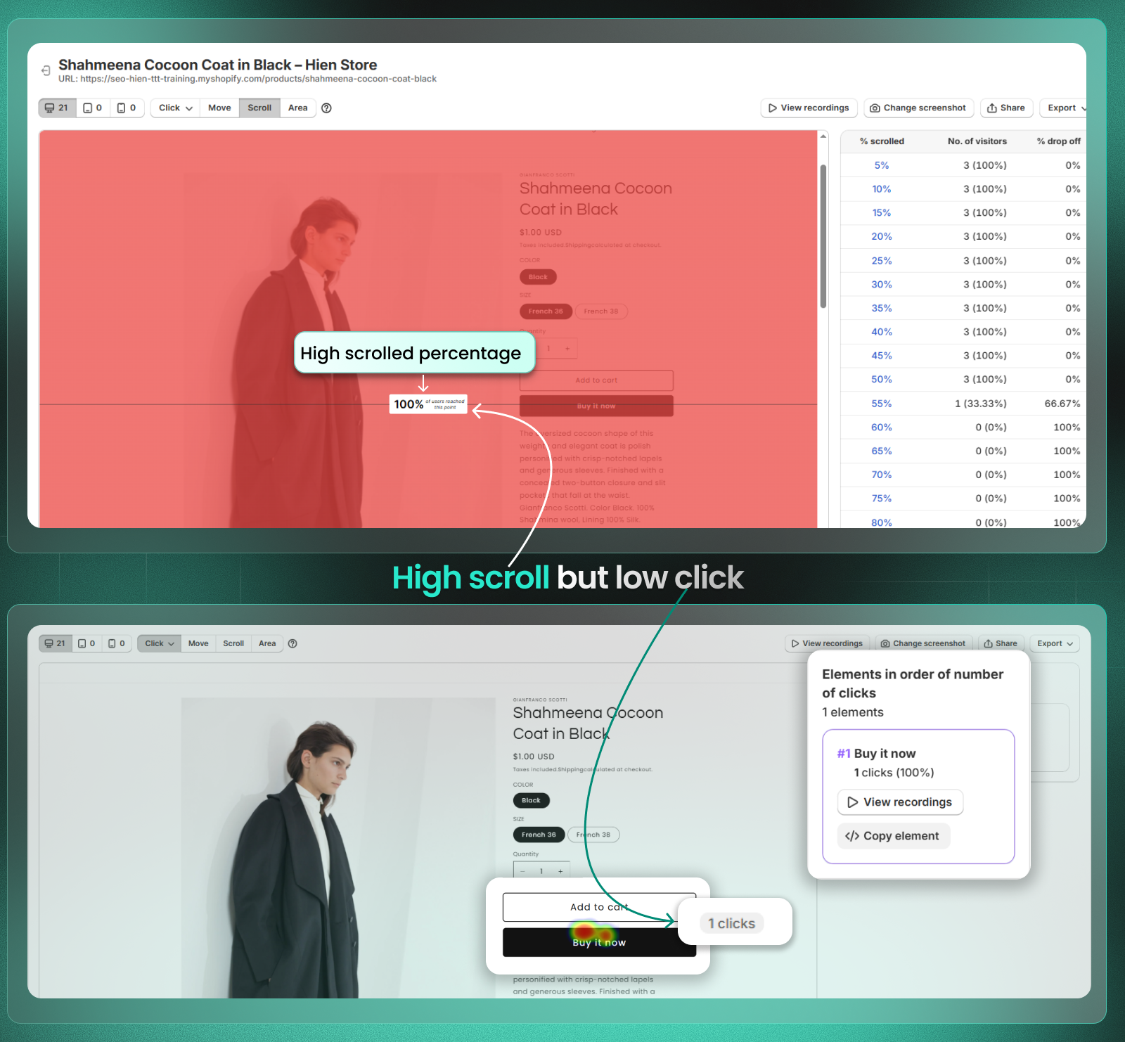
1. The “Window Shopper” (High Scroll, No Click)
- Sign: A visitor scrolls through 75%–100% of your page (visible in Scroll Maps) but leaves without a single click on a Call-to-Action (CTA) (visible in Click Maps).
- Insight: Your content is interesting enough to keep them scrolling, but your primary CTA is either invisible, unconvincing, or placed too low.
- Action: Move your “Add to Cart” or “Shop Now” button higher (above the fold) or make it a sticky button so it is always visible during the scroll.
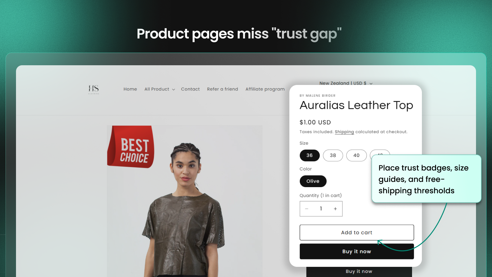
2. The “Hesitant Buyer” (Add to Cart, then Quick Back)
- Sign: The visitor clicks “Add to Cart” but immediately navigates back to the product page or continues browsing other items indefinitely.
- Insight: This often indicates missing information or a “trust gap.” The user is interested but isn’t ready to commit because shipping costs, return policies, or size guides are unclear.
- Action: Place trust badges, size guides, and free-shipping thresholds directly next to the “Add to Cart” button to resolve doubts instantly.
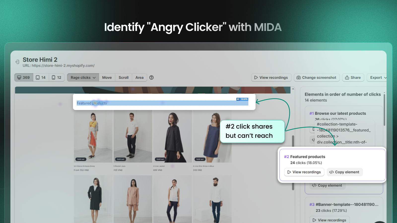
3. The “Angry Clicker” (Rage Clicks)
- Sign: Rapid, repeated clicks in a small area within a short period (highlighted as Rage Clicks in MIDA’s Heatmaps and Session Replays).
- Insight: This is a clear signal of Frustrated Visitors. It usually means a button is broken, a link is dead, or an element (like an image) looks clickable but isn’t.
- Action: Identify the specific element using the CSS selector in the sidebar and fix the technical error or UI design immediately.
4. The “Stalled Finisher” (Lingering at Checkout)
- Sign: A session with high Active Duration on the checkout page, often with a “shaky mouse” or repeated scrolling, followed by an exit.
- Insight: The customer is at the finish line but is scared off by hidden costs, complex forms, or limited payment options.
- Action: For Shopify Plus users, review the recording on the Checkout page to learn how to add payment icons, simplify the form, or fix promotion code. For others, reduce “noise” like pop-ups that might interrupt the checkout flow.
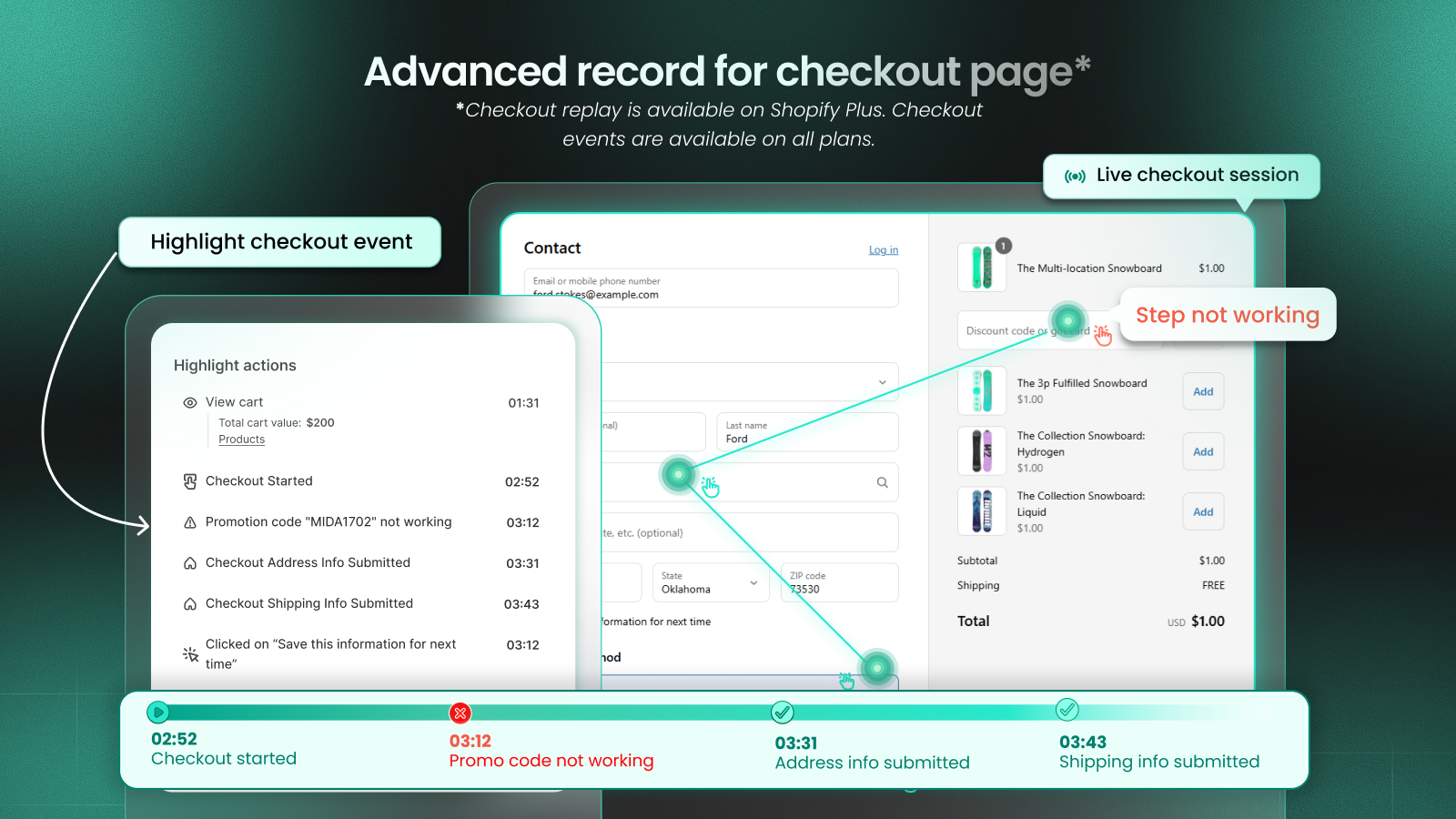
Pro tips:
Non-Shopify Plus merchants cannot modify the checkout UI directly. However, you can still boost credibility by using this clever workaround: Incorporate your trust badges (such as SSL, money-back guarantees, or payment icons) directly into your Header Logo or Checkout Background Image within your Shopify theme settings. This ensures that even without custom code, your high-trust signals are prominently visible to the customer during the most critical stage of the conversion funnel.

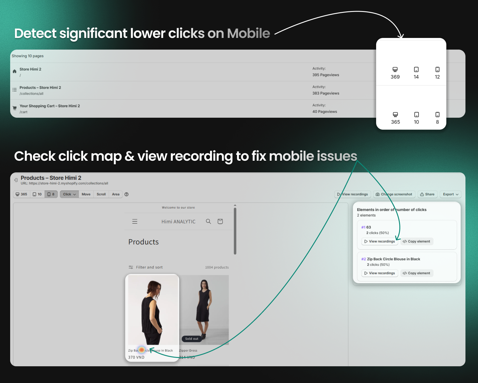
5. The “Mobile Struggle” (Mobile Friction)
- Sign: Comparing Device Information shows a significantly lower click/conversion rate on Mobile vs. Desktop, often accompanied by “Error Clicks” on smaller buttons.
- Insight: Your site may not be fully responsive. CTAs might be too small for thumbs, or hero images might be pushing products too far down the screen.
- Action: Perform a QA (Quality Assurance) check on popular mobile devices. Ensure all buttons are thumb-friendly and that page load speeds are optimized for mobile networks.
FAQ: Session Pattern Analysis for Conversion Optimization
Q: How does session pattern analysis compare to traditional A/B testing?
A: While A/B testing shows which version wins, session patterns reveal why customers don’t convert, allowing you to fix root causes rather than guess at solutions.
Q: Can I identify these patterns without expensive CRO tools?
A: Basic patterns are visible in tools like Google Analytics, but detailed behavioral context requires session recording with commerce integration—something only Shopify-native tools like MIDA provide at scale.
Q: How quickly can I expect to see results from fixing these patterns?
A: Most merchants see significant conversion improvement within weeks of implementing these fixes, with mobile optimization showing the fastest results.
Q: Do I need technical skills to implement these fixes?
A: No—most solutions involve theme adjustments, content changes, or Shopify app configurations that any merchant can handle.
🚀 Stop Guessing, Start Analyzing
Don’t waste time watching random sessions. Use MIDA’s Advanced Filters to find the patterns that matter most.
Pro-Tip: Use the “Frustrated visitors” segment to find Rage Clicks in one click, or filter by “Cart Value > 0” to see why your biggest potential orders are failing.


