What Are Scroll Maps and How to Use Them for Better Conversions
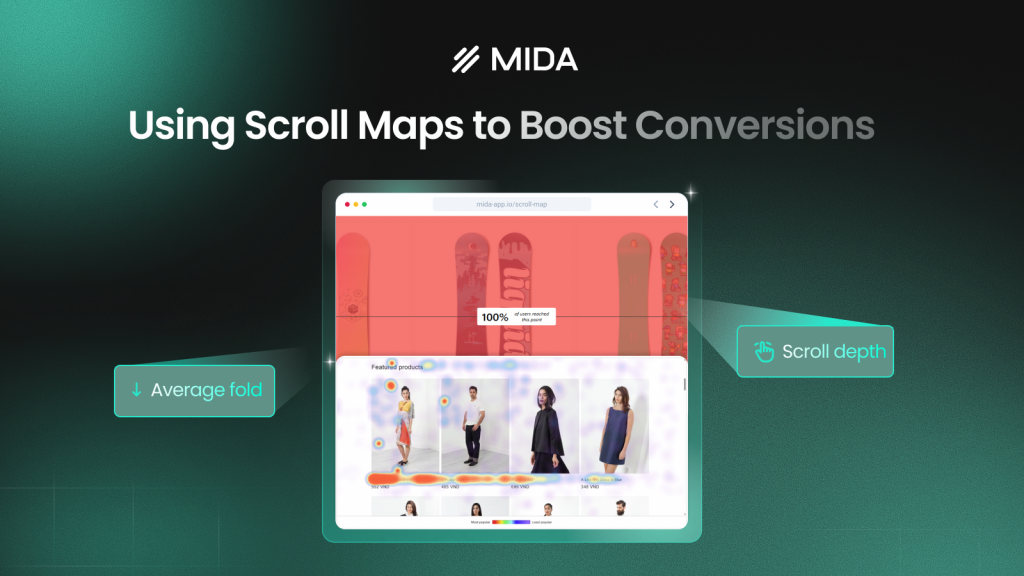
A scroll map is a type of website heatmap that shows how far visitors scroll down a page, using color gradients to reveal where attention drops off. Red and orange mark sections most visitors reach; blue and green show areas fewer people see.
Your analytics tells you 500 people visited a product page. A scroll map shows that only 120 of them scrolled far enough to see your shipping information. This guide covers how scroll maps work, how to interpret the data, and how to use scroll depth insights to place content where shoppers actually look.
>> You may also like:
- Heatmap Analysis: 10 Best Practices for Better Insights
- How to Understand Heatmaps: A Complete Guide
What is a scroll map
A scroll map is a type of website heatmap that visually shows how far visitors scroll down a page. It uses color gradients to display where attention drops off—warm colors like red and orange mark areas most visitors reach, while cooler blues and greens show sections fewer people see. Think of it like a thermal camera for your pages.
The difference between a scroll map and standard analytics is significant. Google Analytics tells you 500 people visited your product page. A scroll map reveals that only 35% of those visitors scrolled far enough to see your customer reviews. One tells you what happened; the other shows you what visitors actually experienced.
You’ll also hear scroll maps called “scroll heatmaps” or “scroll depth maps”—they all refer to the same visualization.
- Warm colors (red/orange): High percentage of visitors reached this section
- Cool colors (blue/green): Fewer visitors scrolled this far down the page
How a scrolling map displays user behavior
When you open a scroll map, you see your actual page overlaid with color bands that shift from hot to cold as you move down. This visualization answers one fundamental question: what content are visitors actually seeing?
Color gradients and percentage indicators
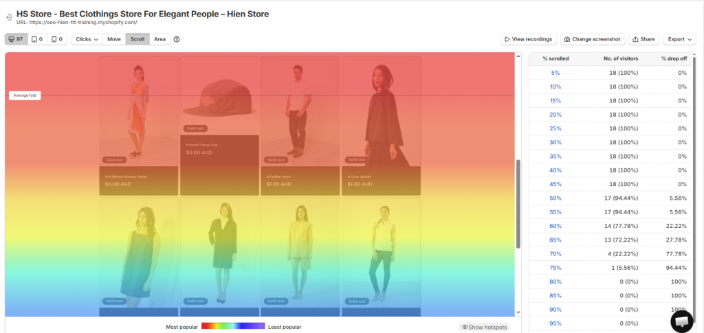
The color overlay typically starts red at the top of your page and gradually fades to blue toward the bottom. Hovering over any section reveals the exact percentage of visitors who reached that point.
If you notice a sharp transition from orange to blue at the 40% mark, that tells you most visitors abandoned before reaching the lower half of your page. The gradient makes drop-off points immediately visible without digging through data tables.
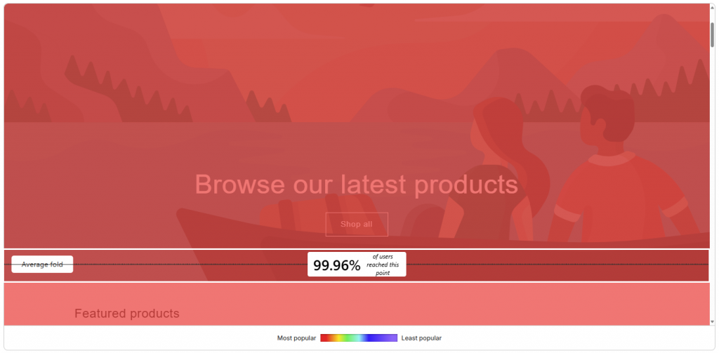
Average fold and visible content zones
The “fold” refers to the portion of your page visible without scrolling—what shoppers see the moment they land. Scroll maps identify the average fold across all visitors, and this varies significantly by device and screen size.
A desktop visitor might see your hero image and first product benefit above the fold. A mobile shopper on the same page might only see the hero image. Knowing where the average fold falls helps you understand what content gets immediate visibility versus what requires active scrolling.
Scroll depth thresholds
Most scroll map tools display common depth markers at 25%, 50%, 75%, and 100% of the page. These thresholds help you quickly gauge whether visitors reach key content without analyzing the entire gradient.
A sharp color change at any threshold signals a drop-off point worth investigating. If the color shifts dramatically at 50%, something at that point on your page is causing visitors to leave.
Scroll heatmap vs click heatmap
Since both tools use color overlays, it’s easy to confuse them. However, they answer different questions about shopper behavior.
Scroll heatmaps show how far visitors travel down a page. Click heatmaps show where visitors tap or click. Each reveals a distinct pattern.
| Feature | Scroll Heatmap | Click Heatmap |
| What it shows | How far visitors scroll | Where visitors click |
| Primary insight | Content visibility and drop-off | Element engagement and interaction |
| Best for | Page length decisions, CTA placement | Button effectiveness, navigation issues |
Combining both gives you a more complete picture. Scroll maps reveal what visitors see, while click maps reveal what they interact with. You might discover that visitors scroll past your add-to-cart button without clicking it—a signal that the button placement works but something else is causing hesitation.
>> See more: Click Maps: What They Are and How They Work
How to use scroll maps to increase conversions
This is where scroll maps move from interesting data to actionable insights. The patterns you spot directly inform layout changes that can affect conversion rates.
Find where visitors stop scrolling
Look for the exact point where the color gradient shifts dramatically. If most visitors stop scrolling before reaching your product benefits section, that content either needs to move higher or the section above it needs to be more compelling.
Your analytics might show a low conversion rate, but your scroll map shows why—shoppers never see your strongest selling points because they’re buried too far down the page.
Spot false bottoms that trigger early exits
A “false bottom” is a design element that makes visitors think the page has ended when more content exists below. Large images, horizontal dividers, or excessive whitespace can create this illusion.
Scroll maps reveal false bottoms by showing sudden drop-offs at specific page sections that don’t correspond to natural stopping points. If you see a sharp color change right after a full-width banner image, that image might be signaling “end of page” to visitors.
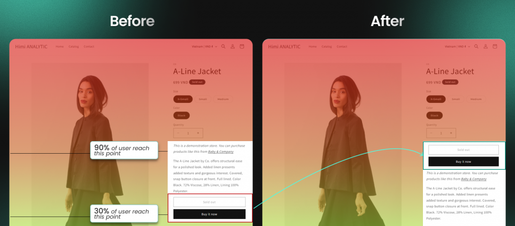
Verify that key content appears above the fold
Use the average fold indicator to confirm your most important elements—CTAs, pricing, trust badges—appear in the visible area without scrolling.
If your add-to-cart button sits below the fold on mobile devices, a significant percentage of shoppers may never see it without deliberate scrolling. The scroll map shows you exactly where the fold falls for different device types.
Confirm shoppers reach CTAs and product details
Check whether critical conversion elements fall in high-engagement zones (warm colors). If your shipping information or customer reviews sit in blue zones, you know to reposition them higher on the page.
The goal is placing conversion-critical content where the data shows visitors actually look—not where you assume they look.
Compare scroll behavior across mobile and desktop
Scroll patterns differ dramatically by device. Mobile visitors typically scroll further but may miss wide content that requires horizontal scrolling. Desktop visitors see more above the fold but often scroll less overall.
Always check both views in your scroll map tool. What works on desktop frequently fails on mobile, and vice versa.
Benefits of adding a scroll map to your website
Beyond tactical applications, scroll maps offer broader advantages for how you approach page optimization.
Visual insights without analytics expertise
Scroll maps translate complex engagement data into an intuitive color overlay anyone can understand. You don’t need a data analyst to interpret the results—if important content sits in a blue zone, it’s not getting seen. The visualization makes the insight immediately obvious.
Faster diagnosis of page layout problems
Instead of guessing why a page underperforms, you immediately see if visitors miss important content. A product page with low add-to-cart rates might have a perfectly good offer that shoppers simply never scroll far enough to discover.
Data-backed decisions on page length and content placement
Scroll maps remove guesswork about whether to shorten pages or rearrange elements. You make changes based on observed behavior rather than assumptions or design preferences. When you can see that 70% of visitors never reach your testimonials section, the decision to move it higher becomes straightforward.
Limitations of scroll maps
Like any analytics tool, scroll maps have boundaries. Understanding these helps you interpret data accurately and know when to reach for complementary tools.
Scroll depth does not reveal visitor intent
Reaching a section doesn’t mean reading it. Visitors may scroll quickly past content without engaging. Scroll maps show exposure, not comprehension or interest.
Pairing scroll data with session replays reveals whether visitors actually stopped to read or just flew past. The scroll map tells you they reached the section; the replay shows you what they did when they got there.
Aggregated data obscures individual sessions
Scroll maps show averages across all visitors, which can mask important differences between segments:
- New vs. returning visitors: First-time shoppers might scroll differently than repeat customers
- Traffic sources: Paid traffic from Instagram might behave differently than organic search visitors
- Device types: Mobile and desktop patterns often diverge significantly
Segmenting your data or watching individual session recordings provides deeper context than aggregate scroll maps alone.
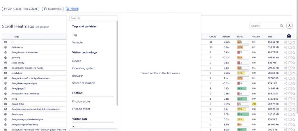
How to set up a scroll map on your website
Getting started with scroll tracking typically takes just a few minutes. Thoughtful configuration helps you get meaningful insights faster.
Step 1. Install a scroll tracking script or app
Scroll maps require adding a tracking snippet to your site or installing a dedicated app. Shopify-native tools like Mida handle installation automatically without code editing—you install from the App Store and tracking begins immediately.
For non-Shopify sites, most tools provide a JavaScript snippet you paste into your site’s header.
>> You may also like: Best Shopify Heatmap Apps: 12 Tools Tested for Performance in 2026
Step 2. Select pages to monitor
Start with high-traffic, high-value pages: your homepage, top product pages, and landing pages for paid campaigns. Monitoring every page dilutes your focus and makes it harder to spot meaningful patterns.
Prioritize pages where you suspect scroll behavior might be affecting conversions—long product pages, content-heavy landing pages, or any page with important information below the fold.
Step 3. Collect enough sessions for accurate data
Scroll maps need sufficient traffic to produce reliable patterns. Low-traffic pages require more time to gather meaningful data.
Avoid drawing conclusions from sparse data. Patterns become clearer with more sessions, and acting on incomplete data can lead you to make changes that don’t actually address real behavior patterns.
Step 4. Segment and review your scroll map
Filter by device type, traffic source, or visitor type (new vs. returning) to uncover patterns hidden in aggregate data.
A scroll map showing “average” behavior might mask that mobile visitors drop off much earlier than desktop visitors. Segmentation reveals these differences so you can address them specifically.
How to analyze and interpret scroll map data
Having a scroll map is one thing. Knowing what to do with it is another. Here’s how to extract actionable insights from the data.
Locate sharp drop-off points
Look for abrupt color changes rather than gradual fades. A sudden shift from orange to blue indicates a significant percentage of visitors stopped scrolling at that exact point.
Examine what appears at that location on your page. Is there a confusing section? A false bottom? Content that doesn’t compel further scrolling? The drop-off point tells you where to look; you still need to figure out why.
Benchmark against average fold by device
Use the average fold marker to assess content visibility across devices. If your primary CTA falls below the fold on mobile, it likely needs repositioning.
Compare mobile and desktop fold positions—they’re often dramatically different. A button that’s prominently visible on desktop might require significant scrolling on mobile.
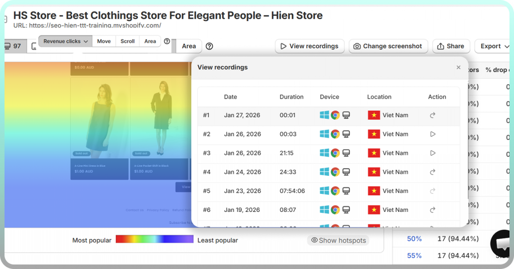
Cross-reference with click heatmaps and session replays
Scroll maps work best alongside other behavior tools:
- Click heatmaps: Confirm visitors interact with elements they scroll past
- Session replays: Watch individual journeys to understand why visitors stopped scrolling
Mida connects scroll depth data directly to session recordings, letting you jump from a drop-off insight straight to video evidence of what happened. Instead of guessing why visitors left at the 60% mark, you can watch actual sessions and see the behavior firsthand.
Start using scroll maps to remove conversion blockers
Scroll maps reveal what visitors see—and what they miss—so you can fix layout issues blocking conversions. Instead of debating whether your page is too long or whether your CTA placement works, you watch real behavior and make changes based on evidence.
Adding scroll tracking to your store takes minutes. The insights you gain can reshape how you think about page design, content placement, and the shopper journey from landing to purchase.
FAQs about scroll maps
How much traffic does a scroll map need to show reliable data?
Low-traffic pages take longer to reveal consistent patterns. Wait until your heatmap shows stable color gradients across multiple days rather than acting on incomplete data. For most pages, a few hundred sessions provide a reasonable baseline, though higher-traffic pages will show reliable patterns faster.
Can you segment scroll maps by traffic source or customer type?
Most scroll map tools allow filtering by device, referrer, or visitor segment. This segmentation reveals how different audiences engage with the same page—paid traffic from one campaign might scroll differently than organic search visitors or email subscribers.
What scroll depth indicates visitors are engaged with a page?
“Good” depth depends entirely on page purpose. Product pages ideally see visitors reach the add-to-cart button and reviews section. Blog posts naturally have lower completion rates since readers often find what they need partway through. Compare your scroll depth against your conversion goals rather than arbitrary benchmarks.
How often should you review scroll map data?
Check after design changes, new campaigns, or periodically (weekly or monthly) to catch emerging issues. Scroll patterns can shift as your traffic mix changes or as you update page content. Regular review helps you spot problems before they significantly impact conversions.
Do scroll maps work on Shopify checkout pages?
Standard tools often cannot track checkout due to Shopify’s hosted checkout restrictions. Shopify-native heatmap apps like Mida can capture checkout behavior, giving you visibility into the final steps where many conversions are lost. If checkout tracking matters to you, verify the tool’s capabilities before installing.


