Click Maps: What They Are and How They Work
A click map is a visual overlay that shows where visitors click on your webpage, using color gradients to highlight high-activity and low-activity zones. It transforms raw click data into something you can actually see and act on.
Analytics tells you how many people visited a page. A click map shows you that half of them clicked on an image expecting it to do something—and nothing happened. This guide covers how click maps work, the different types available, and how to use them to spot friction and improve conversions on your store.
What is a click map
A click map is a visual overlay that shows where visitors click on your webpage using color-coded hotspots. Red and orange areas indicate high click concentration, while blue and green show spots that receive fewer clicks. You can think of it like a thermal camera for your website—except instead of measuring heat, you’re measuring where people actually interact.
The difference between click maps and standard analytics comes down to depth. Google Analytics tells you 500 people visited your product page. A click map shows you that 300 of those visitors clicked on a product image expecting it to zoom—but nothing happened. One gives you a number; the other gives you something you can fix.
Click maps are sometimes written as one word (“clickmaps”), and you’ll see both spellings across different tools and documentation.
How click maps work
When you install a click map tool, it adds a small tracking script to your site. That script records the exact position of every click or tap on each page, then combines all that data into a single visual layer.
Here’s what happens behind the scenes:
- Tracking script: Records the X and Y coordinates of each click as visitors interact with your page
- Data aggregation: Combines click data from hundreds or thousands of sessions into one view
- Color overlay: Applies a gradient from cool to warm colors based on how many clicks each area received
After enough visitors interact with your page, clear patterns emerge. Hotspots show where attention concentrates. Cold zones reveal what gets ignored.
Types of click maps
Different click map types answer different questions. The one you choose depends on what you’re trying to learn about visitor behavior.
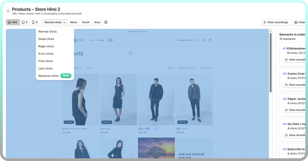
Standard/normal click maps
Standard click maps show total click distribution across your page. Every click gets recorded and added to the aggregate view, regardless of what was clicked or whether the click triggered anything.
These work well for understanding overall engagement—which sections attract interaction and which get skipped entirely.
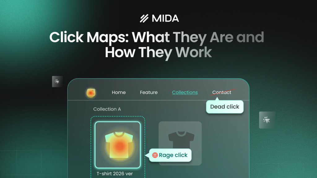
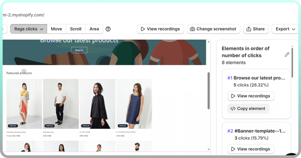
Rage click maps
Rage clicks are rapid, repeated clicks in the same spot. When someone clicks a button five times in two seconds, they’re frustrated that something isn’t responding.
Rage click maps highlight frustration hotspots. They often reveal broken elements, slow-loading buttons, or confusing interface patterns that standard click maps miss.
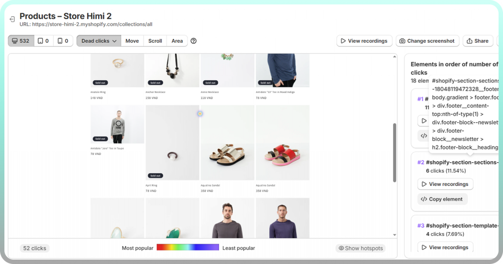
Dead click maps
Dead clicks happen when visitors click on something that isn’t clickable. Maybe they clicked an image expecting it to enlarge, or tapped a headline thinking it was a link.
Dead click maps expose gaps between what visitors expect and what your page actually does. A cluster of dead clicks on a product image tells you visitors want functionality you haven’t provided.
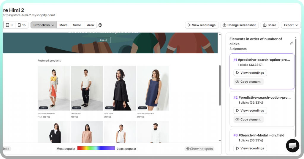
Error clickmaps
Error click maps add another critical layer of insight by showing clicks that occur immediately before a JavaScript error happens. Instead of looking at errors in isolation, this view connects technical failures directly to real user actions. It helps teams understand what users were trying to do when something broke, making it easier to prioritize fixes based on real experience impact rather than raw error logs alone.
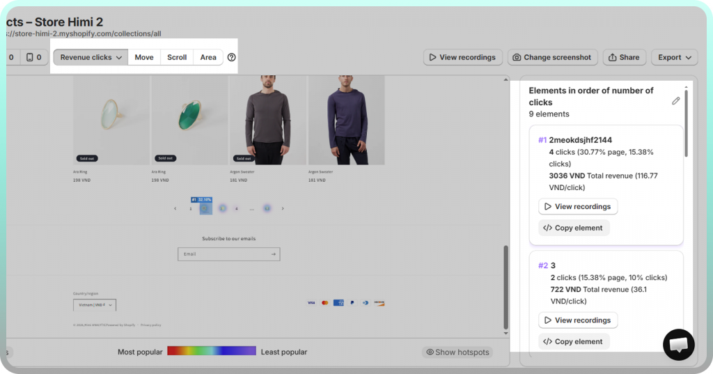
Element-level and revenue clickmaps
Rather than showing click coordinates on a page, element-level click maps tie click data to specific components—buttons, images, navigation links, product modules.
This approach lets you see click-through rates and revenue data for individual elements. You might discover your “Add to Cart” button gets a 4% CTR while a competing element nearby gets 12%.
Click maps vs heatmaps
Click maps are one type of heatmap, not a separate category. The term “heatmap” covers several visual data overlays, and knowing the family helps you pick the right tool for each question.
| Feature | Click maps | Scroll maps | Movement maps |
| What it tracks | Clicks and taps | How far users scroll | Cursor movement |
| Best for | Finding engagement hotspots | Checking content visibility | Understanding reading patterns |
| Key insight | What users interact with | What users actually see | Where users hesitate |
When to use click maps
Click maps answer questions about interaction: Which buttons get clicked? Which links get ignored? Are visitors clicking on elements that aren’t actually clickable?
Use click maps when you want to evaluate CTA placement, identify broken or confusing elements, or understand which parts of your page drive the most engagement.
When to use scroll or movement heatmaps
Scroll maps answer visibility questions. If only 30% of visitors scroll past your hero image, that detailed product description at the bottom might as well not exist for 70% of your traffic.
Movement maps track cursor position as a proxy for visual attention. They’re less precise than click data but can reveal where visitors pause or hesitate before taking action.
>> You may also like: How to Understand Heatmaps: A Complete Guide
Why use click maps on your website
Click maps turn optimization from guesswork into evidence. Instead of debating whether a button placement “feels right,” you see exactly how visitors interact with it.
Identify high-performing elements
Click maps reveal which elements on your page actually attract engagement. You might discover that a secondary link in your navigation gets more clicks than your primary CTA.
When you know what works, you can replicate that success elsewhere. A product badge that consistently draws clicks on one page might perform equally well across your entire catalog.
Spot ignored CTAs and dead zones
Cold zones on a click map are just as valuable as hot zones. If your “Shop Now” button sits in a sea of blue while a decorative image nearby glows red, you’ve found a problem worth investigating.
Layout issues often aren’t obvious from looking at the design. A CTA that looks prominent to you might be invisible to visitors scanning the page quickly.
Validate design and layout changes
Click maps work as before-and-after tools. Run a click map on your current product page, make a change, then run another click map to see if engagement shifted where you expected.
This approach removes uncertainty from redesigns. Instead of hoping a new layout performs better, you watch real visitor behavior and confirm whether it does.
Reduce guesswork in optimization
Analytics might tell you that add-to-cart rates dropped 15% last month. Click maps might show you that visitors are clicking on a non-clickable size chart image instead of the actual size selector dropdown.
The difference between knowing that something happened and understanding why it happened determines whether you can actually fix it.
How to read click map data
A click map is only useful if you know how to interpret what you’re seeing. The colors and patterns tell a story, but you have to know how to read it.
Understanding color gradients
The color scale runs from cool to warm based on click concentration:
- Red/Orange: High click density—lots of visitors clicked here
- Yellow: Moderate click activity
- Green/Blue: Low click density—few visitors clicked here
- No color: Zero clicks recorded
Keep in mind that “high clicks” isn’t automatically good. A decorative element with high clicks might be stealing attention from your CTA. A checkout button with moderate clicks might be performing exactly as expected.
Analyzing click clusters
Tight clusters on interactive elements like buttons and links typically indicate clear user intent—visitors understood what to click and did so confidently.
Scattered clicks across non-interactive areas suggest confusion. If clicks spread randomly across a product image, visitors might be trying to zoom, swipe, or interact with something that doesn’t respond.
Identifying rage and dead clicks
Rage clicks appear as intense hotspots with unusually high click counts in a small area. If you see a button with 500 clicks from 100 visitors, something is frustrating people.
Dead clicks show up as hotspots on elements that aren’t supposed to be clickable—images, text blocks, icons. They reveal unmet expectations you can address by either making the element interactive or clarifying that it isn’t.
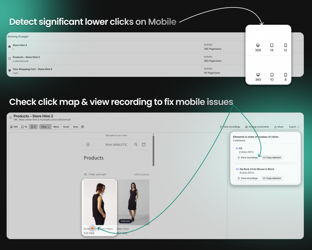
Comparing devices and segments
Click patterns often differ dramatically between desktop and mobile visitors. A button that’s easy to click with a mouse might be too small to tap accurately on a phone.
Most click map tools let you filter by device type, traffic source, or visitor segments. Comparing views often reveals problems that aggregate data would hide—like a checkout flow that works fine on desktop but breaks on mobile.
How to set up a click map
Getting started with click maps typically takes just a few minutes, especially with tools built for your platform.
Step 1: Install a click map tool on your site
For Shopify stores, the easiest path is installing a Shopify-native heatmap app directly from the App Store. Tools like Mida install with one click and begin tracking automatically—no code editing required.
If you’re using a general analytics platform, you’ll typically add a JavaScript snippet to your theme. Most tools provide copy-paste instructions that work with standard Shopify themes.
Step 2: Select pages to track
Start with your highest-impact pages: homepage, top product pages, collection pages, cart, and checkout. These pages see the most traffic and have the biggest influence on revenue, so insights here deliver the most value.
You can expand tracking to other pages later, but focusing initially on high-traffic pages ensures you collect meaningful data quickly.
Step 3: Review and analyze click data
Wait until you’ve collected enough sessions before drawing conclusions. A click map based on 50 visits might show random noise; a click map based on 500 visits reveals actual patterns.
Most tools produce reliable insights after 200-300 sessions per page. For pages with lower traffic, you might wait a week or more before the data becomes actionable.
Using click maps to improve ecommerce conversions
Click maps become especially powerful when applied to ecommerce-specific pages and flows. The patterns you find often point directly to revenue opportunities.
Analyzing product pages
On product pages, check whether visitors click on the elements that matter most:
- Product images (are visitors trying to zoom?)
- Size guides and variant selectors
- Reviews and ratings
- Add-to-cart buttons
You might discover that shoppers repeatedly click on product images expecting a zoom function, or that your size guide link gets almost no clicks despite being prominently placed.
Optimizing cart and checkout flows
Cart and checkout pages are where click maps often reveal the most valuable insights. Look for clicks on trust badges, shipping information, discount code fields, and payment options.
If visitors are clicking around the shipping section repeatedly, they might be confused about costs or delivery times. If they’re clicking on a trust badge that doesn’t do anything, they might be looking for reassurance you haven’t provided.
Connecting clicks to session replays
Click maps show you where visitors click, but session replays show you why. The combination is more powerful than either tool alone.
Tools like Mida let you jump directly from a click hotspot into recordings of sessions where that element was clicked. Instead of guessing why visitors rage-clicked a button, you watch the full context leading up to that moment.
Try Mida free to see click maps, session replays, and heatmaps built for Shopify stores.
Common click map mistakes to avoid
Click maps are straightforward to use, but a few common mistakes can lead to wrong conclusions:
- Drawing conclusions too quickly: Patterns based on 50 sessions often don’t hold up at 500—wait for enough data
- Ignoring mobile click maps: Desktop and mobile behavior differ significantly, and aggregate data can mask device-specific problems
- Focusing only on hot zones: Cold zones reveal missed opportunities just as much as hot zones reveal engagement
- Not combining with other tools: Click maps show what happened but not why—pair them with session replays or surveys for the full picture
See what shoppers click and why it matters for revenue
Understanding click behavior helps you remove friction and optimize for conversions. When you see what visitors engage with and what they ignore, you can make changes based on evidence rather than assumptions.
Try Mida free to see click maps, session replays, and heatmaps built for Shopify stores.
FAQs about click maps
How often should you review click map data?
Review click maps after collecting enough visitor interactions—typically after a week or after making a design change. Looking at data too frequently can lead to reacting to noise rather than patterns. For ongoing monitoring, a weekly or bi-weekly review cadence works well for most stores.
Can click maps track mobile and desktop separately?
Yes, most click map tools let you filter by device type so you can compare how mobile shoppers interact with your pages versus desktop visitors. This separation matters because tap behavior on phones differs from click behavior with a mouse—buttons that work fine on desktop might be too small or poorly positioned on mobile.
Do click map tools slow down your website?
Lightweight click map tools add minimal load time, typically using asynchronous scripts that load after your page content renders. Shopify-native solutions like Mida are optimized to avoid impacting store speed. You can verify performance impact by running PageSpeed tests before and after installation.
Can you connect click map data to orders or revenue?
Some tools let you filter click maps by visitors who completed purchases, so you can see which elements correlate with actual conversions. Mida, for example, connects behavior data to Shopify order information, letting you compare click patterns between buyers and non-buyers.
What is the difference between a click map and a scroll map?
A click map shows where users click on a page, while a scroll map shows how far down the page users scroll before leaving. Click maps answer questions about interaction and engagement; scroll maps answer questions about content visibility. Most heatmap tools offer both types, and using them together gives you a more complete picture of visitor behavior.


